- The walk past
- The first thirty seconds inside
- The table
- The menu
- Light and sound
- The small things people take home
- Putting it together
We're not very relaxing people to eat with. Two designers trying to have a normal lunch will get completely derailed by the menu typography, the chairs, the plates, the lighting, the colour of the walls, the logo, why they chose that napkin, and whether we'd have moved the sign 10cm to the left.
Your guests probably won't say any of that out loud. But they notice it, mostly without realising, and it decides whether your place feels like itself or like everywhere else. It also decides whether they take a photo, whether they come back, and how they describe you to a friend. This guide walks through the whole thing in the order a guest actually experiences it, with a checklist for each step. You can do all of it yourself.
Part 1The walk past
Most people decide whether to come in before they've seen the menu. They're walking down the street, or driving past, or looking at you on Google Maps, and they're making a very quick judgement about what kind of place you are and whether it's for them.
Your signage, your awning, your windows and whatever's outside the door are your loudest marketing. They're seen by far more people than your Instagram, every single day, for free.
- Can you read your name from across the street? From a moving car? Most signs we see are too small and too thin.
- Is it obvious what you are? A restaurant, a bar, a café, a deli? If it isn't clear from the outside, a lot of people won't risk it.
- Is the menu (or at least a sample of it) visible from outside, with prices? People are much more likely to walk in when they know roughly what it costs.
- Are your opening hours on the door, set properly, and correct? Check Google too. Wrong hours online lose more customers than almost anything else.
- What does it look like at night? Walk past after dark. Is the sign lit? Can you see into the room? Does it look open?
- Is there one thing people will remember? A colour, an awning, a mural, a van, a bench outside. Something that makes it easy to say "the place with the striped awning".
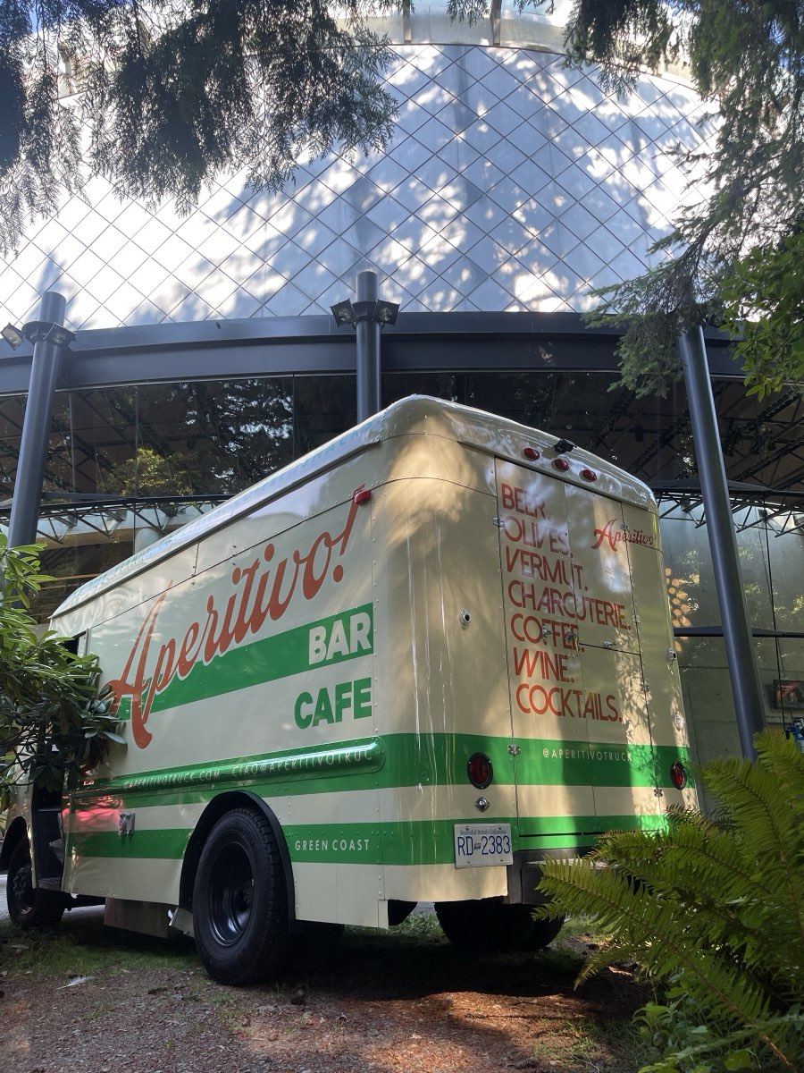
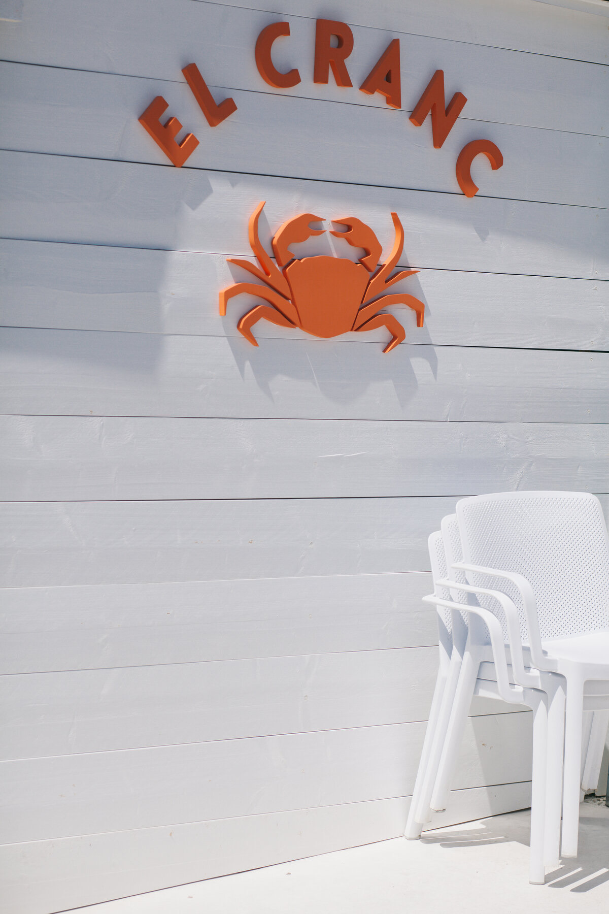
For Aperitivo, a mobile bar in a 1962 Grumman stepvan, the van itself is the sign, the menu and the brand all at once. For El Cranc, a beach chiringuito, it's big red letters and a crab on white boards. Neither is complicated. Both are very easy to remember.
Part 2The first thirty seconds inside
The moment someone opens the door, they're taking in a huge amount: the light, the noise level, the smell, whether anyone's looked up, where they're supposed to go. If they feel unsure for even a few seconds, it sets a slightly awkward tone for the whole meal.
- Is someone going to acknowledge them within a few seconds, even with just a look and a smile?
- Is it clear whether to wait to be seated or find a table? If not, a small sign helps.
- Where do coats, bags, buggies and wet umbrellas go? It sounds boring, but people remember feeling awkward.
- Is the entrance clear, or is it where deliveries, high chairs and the card machine charger live?
- What's the first thing they see? Ideally it's the room at its best: the bar, a beautiful table, the kitchen, the view. Not the toilets or a pile of boxes.
Part 3The table
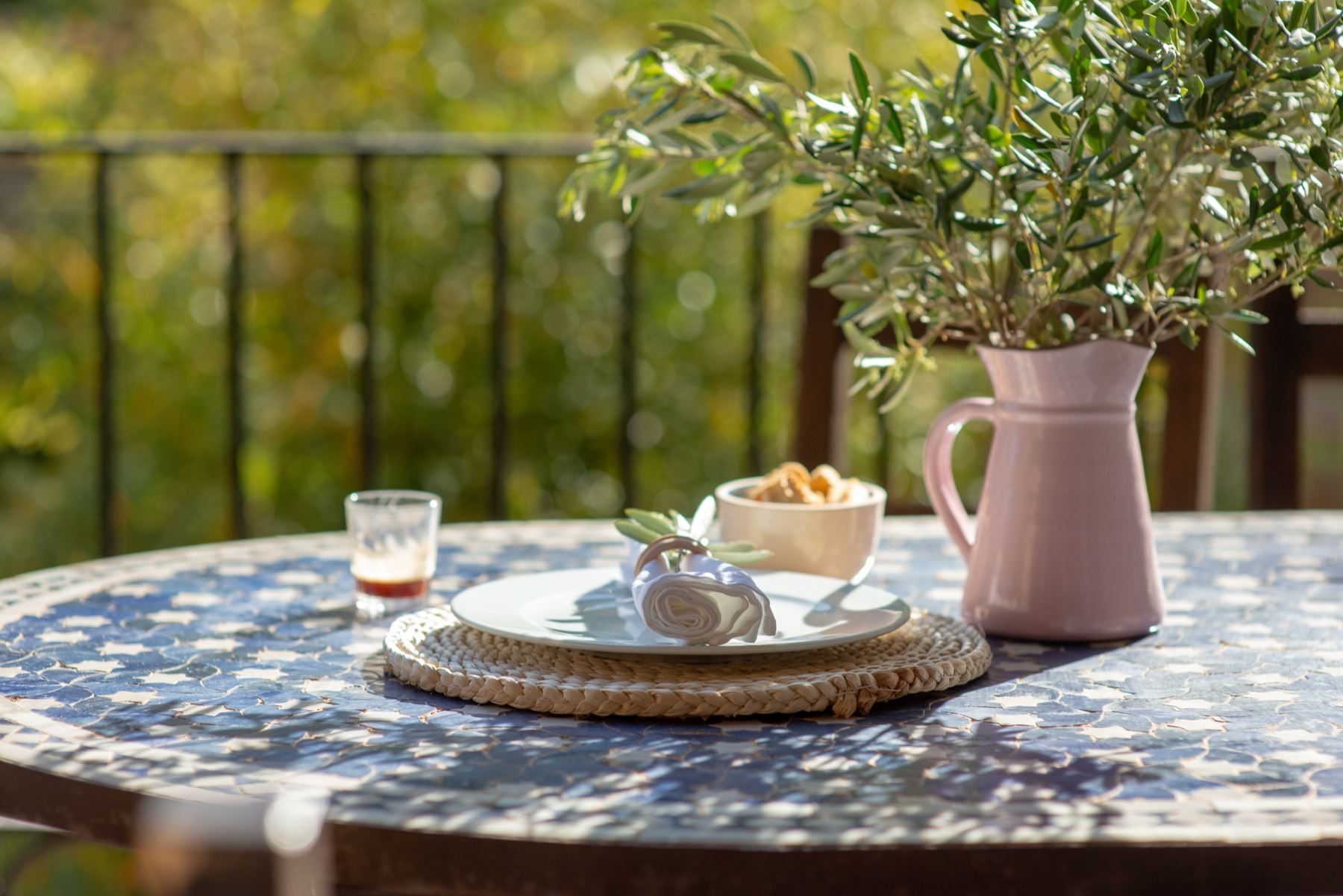
Once someone sits down, the table becomes their whole world for the next hour or two. Everything on it, and everything they're sitting on, is being looked at and touched. This is where small choices add up to the feeling of a place.
Chairs are a big one. People choose restaurants based on the chairs more than you'd think (we certainly do). A chair that's comfortable, sturdy and a little bit interesting does a lot. And it doesn't have to be expensive: some of our favourite places use simple café chairs, or a mix of second-hand ones that don't quite match.
- Sit in every type of seat you have. Are any uncomfortable after an hour? Wobbly? Too low for the table?
- Is the glassware something you're proud of? It's the most-touched object in the room. (We wrote a whole post about the glass on the table.)
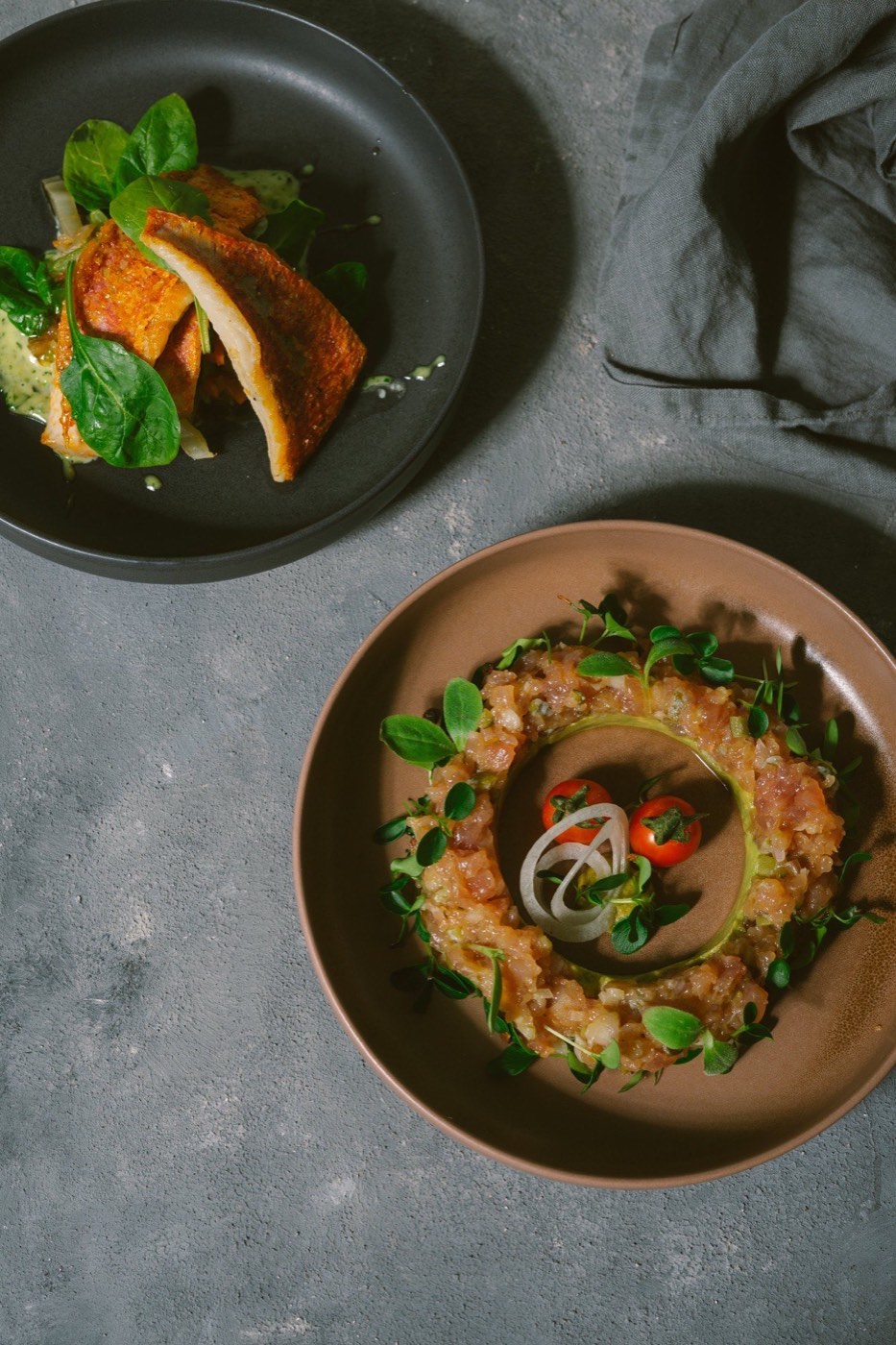
- Plates and cutlery: do they feel like your restaurant, or like a catalogue? They don't need to match perfectly.
- Napkins: paper, linen, printed, plain? Each says something different. A linen napkin in a casual place can feel generous. A good printed paper napkin can be a little piece of branding.
- Salt, pepper, oil, the water jug, the little dish for olives. These are tiny chances to show you care.
- What's on the table before anyone orders? A bare table can feel cold. A table with a candle, a jug of water and the menu feels like you've been expected.
Part 4The menu
Before anyone tastes anything, they read. A menu is a piece of writing, a piece of design and a price list all at once, and it's held by every guest for several minutes. It's the first proper taste of your restaurant. It deserves more attention than most places give it.
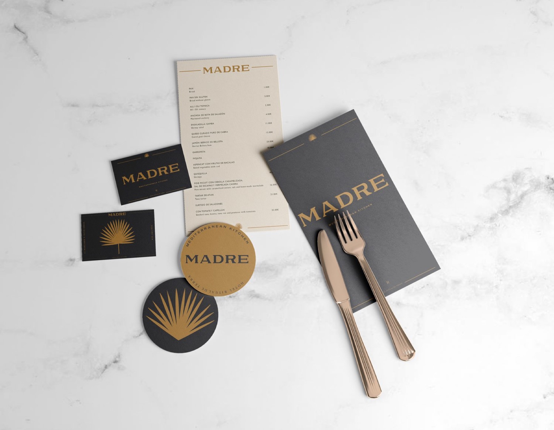
When we look at a menu, we look at four things: how easy it is to find your way around, the type, the material, and how it's handled. Here's the checklist we use.
- Navigation. Can someone understand the structure in a few seconds? Clear sections, in the order people eat. If people often ask "how does it work here?", the menu should answer that.
- Length. Shorter is almost always better. A long menu makes people anxious and makes the kitchen look less confident. If it doesn't fit on one side, ask whether it needs to.
- Dish names. Say what's on the plate, in the words you'd use at the table. "Butternut, pine nut, salted buffalo curd" is better than a paragraph of adjectives.
- Type size. Test it at arm's length in your actual lighting. As a rough guide, dishes shouldn't be smaller than about 10–11pt for most typefaces, and bigger if your room is dark or your guests skew older.
- Contrast. Light grey type on cream paper looks lovely in the studio and is unreadable by candlelight. Print a test and read it at your darkest table.
- Prices. Line them up consistently. Leaving off currency symbols and decimals (12 rather than €12.00) is calmer to read. Don't hide them.
- Allergens and dietary info. Required in a lot of places, and genuinely useful. Use a small clear key rather than cluttering every line.
- Material. Thick card, thin paper, a clipboard, a board on the wall. Choose what suits how often you change it and how messy it'll get.
- Handling. Will it survive a busy Saturday? Can it be wiped, or easily reprinted? A menu covered in oil marks says something you didn't mean to say.
- Updating. Who changes it when a dish runs out, and how quickly? Design it so that's easy. A template someone on your team can edit is worth a lot.
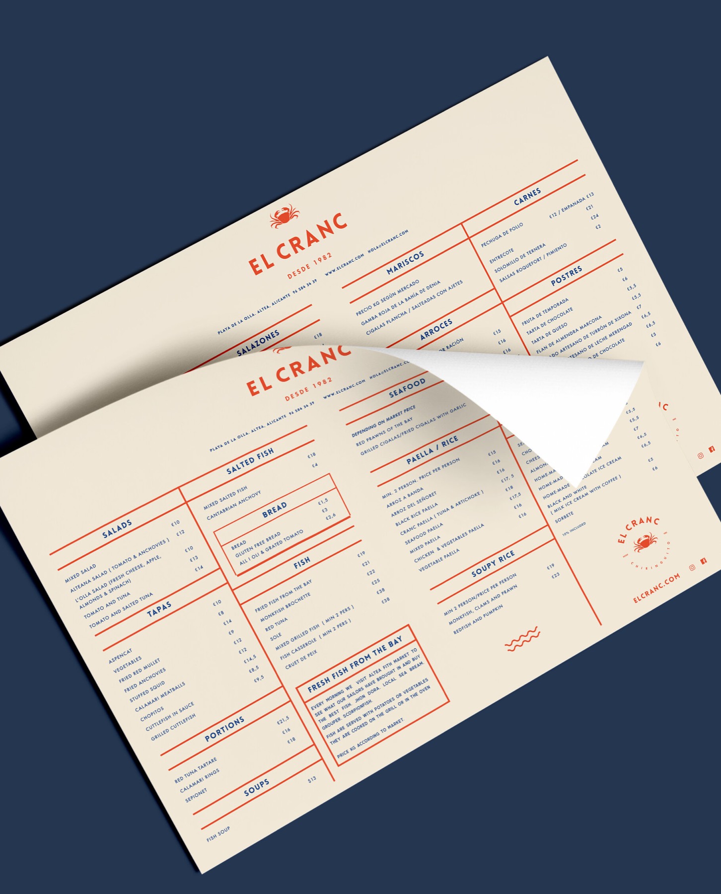
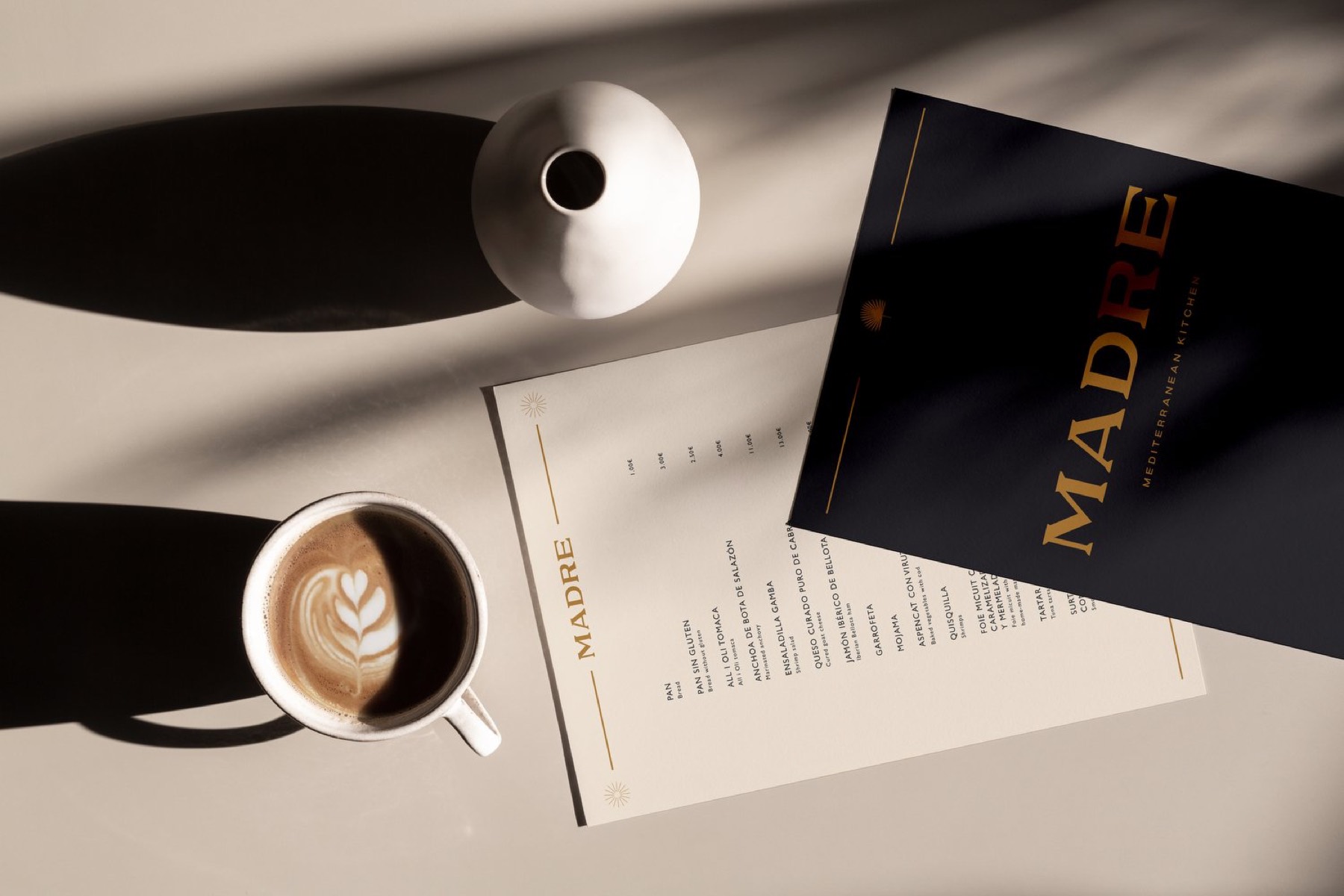
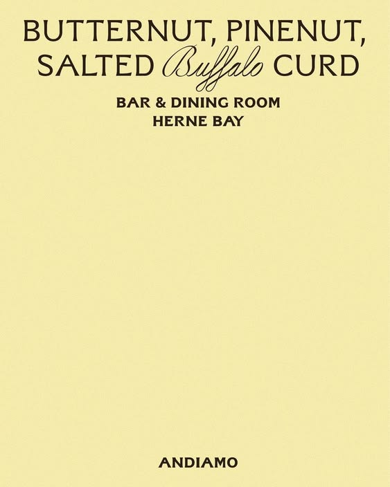
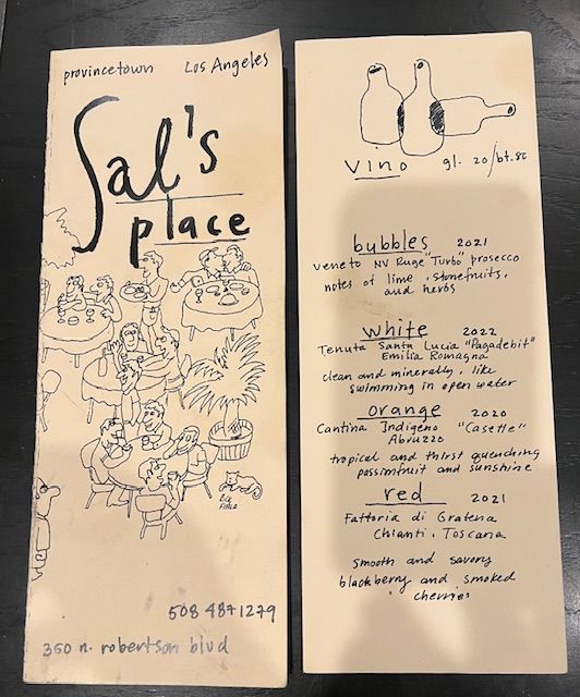
There are some menus we love in menus worth stealing, with notes on what each one gets right.
Part 5Light and sound
We judge restaurants by the lighting before the food. It's probably the single biggest thing that decides how a room feels, how people look to each other, and how the food looks on the plate (and in photos).
- Warm light. Look for bulbs around 2700K (that's "warm white"). Cold, blue-ish light makes food and faces look tired.
- Light on the table, not in people's eyes. Pendants low over tables, wall lights, candles. Avoid bright overhead light shining down on everyone.
- Dimmers. The same room needs to feel different at 1pm and 9pm. Dimmers are cheap and make a huge difference.
- Check every seat. Some tables are always the "bad" tables because of one light. Sit there and you'll see why.
- Daytime matters too. Can you control harsh sun with blinds, an awning, a curtain? Squinting guests don't stay for dessert.
- Music. Have someone choose it on purpose, at a volume where you can talk without raising your voice. Silence is worse than you'd think. A random radio station is worse still.
- Acoustics. If it's too loud, soft things help: curtains, cushions, a rug, tablecloths, even art on the walls.
Part 6The small things people take home
When the meal's over, there's one more chance to be remembered. The bill, the goodbye, and anything small a guest takes away with them.
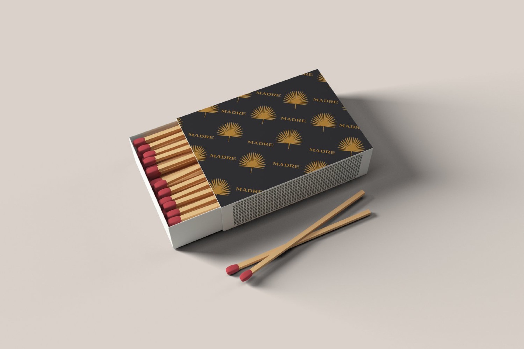
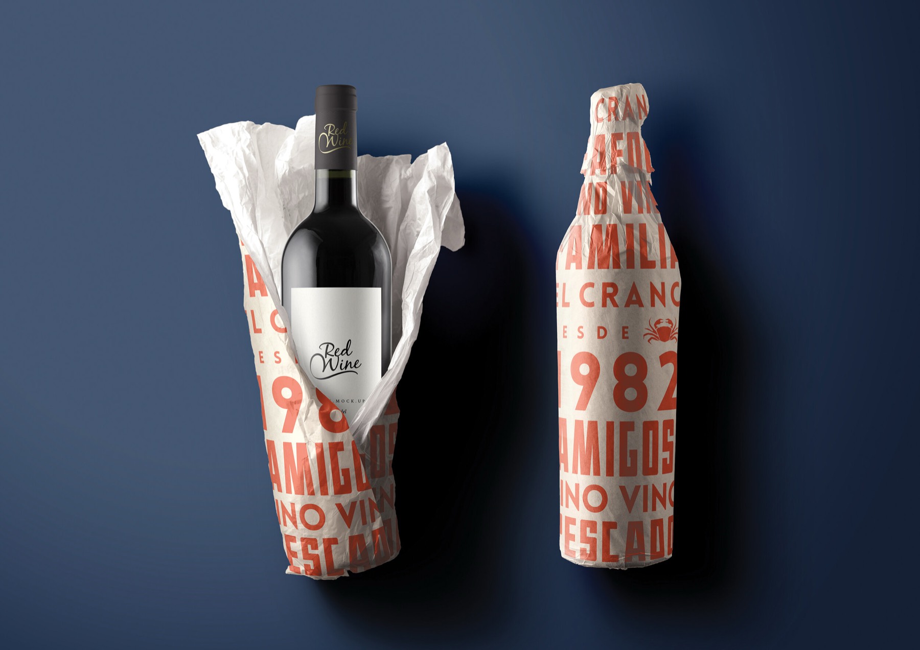
Old restaurants used to give out matchbooks for exactly this reason: a cheap, beautiful thing that ended up in someone's kitchen drawer for years. Today it might be a postcard with your address, a printed sugar sachet, a business card worth keeping, a coaster, a bottle wrapped in printed paper. It costs very little and it travels.
- How is the bill presented? A nice little dish or folder, or a receipt dropped on a sticky table?
- Is there anything with your name and address on it that someone could take? A card by the door at least.
- Takeaway: is the bag, box or cup something you'd be happy to see walking down the street? That's what it is: an advert.
- If you sell anything (wine, oil, sauce, merch), is it visible and easy to ask about?
- Does someone say goodbye? It sounds obvious, but it's the last memory people leave with.
Part 7Putting it together
You won't fix all of this at once, and you don't need to. After your meal as a guest, choose three things: one that's free (moving something, changing the music, turning the lights down at 8pm), one that's cheap (new bulbs, a sign on the door, a printed card), and one bigger thing to plan for (the menu, the signage, the chairs).
The biggest thing to keep in mind is that all of these little choices should feel like they belong to the same place. The sign, the menu, the glass, the napkin, the playlist and the matchbox. When they do, people feel it immediately, even if they could never explain why.
If you're opening something new, or your place has outgrown its first menu and sign, tell us about it. This is exactly the kind of thing we love working on.