- They choose one view
- Colour does the talking
- The name is enough
- Why we like what we like
- Then print it
Old travel posters sell a feeling, not a list of facilities. One view, one colour that tells you it's hot, and the name of the place in big letters. That's it. There's nothing about the size of the pool, the thread count or what time breakfast finishes, and somehow you want to go much more than you do after reading most hotel websites.
We save a lot of them, and when we look back at the board it's never the most technically impressive ones we come back to. It's the ones where somebody decided what the place actually felt like and painted only that.
Part 1They choose one view
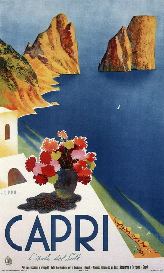
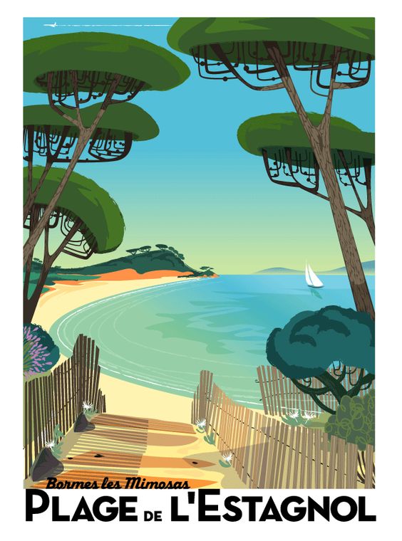
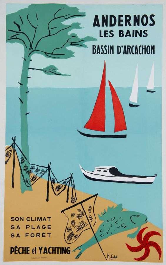
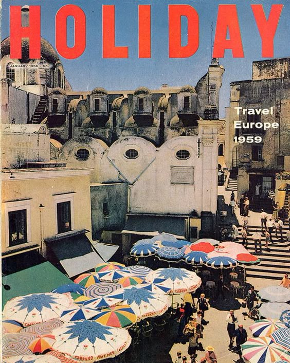
Look at the Capri poster. It's cliffs and water, and a blue that's almost too blue. The Plage de l'Estagnol one is pine trees, a curve of sand and that pale sea. They're not showing you everything. They're showing you the moment you'd remember.
Every hotel has its version of this. It's usually the photo guests take on the first evening, or the view from one particular table, or the walk down to the water. When we start working with a hotel, one of the first things we ask is: what's the picture everyone takes? Because that's your poster. If you build the brand around it, and use it on the website, the welcome card, the booking confirmation and the print in the room, people arrive already knowing what they came for.
Part 2Colour does the talking
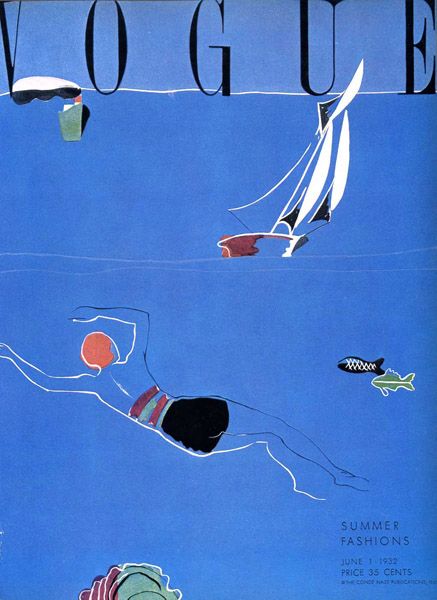
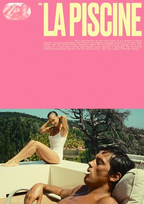
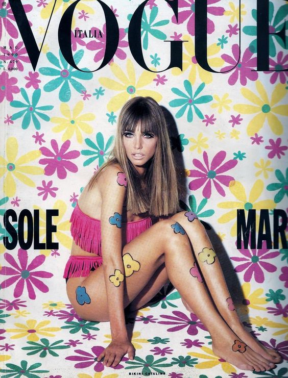
One of the things we love most about these is how the colour carries the whole message. You don't need to read anything to know the Vogue cover is about summer. The pink on La Piscine is a slightly ridiculous pink, and that's exactly why it works. It's confident.
We think about this a lot with hotels on the Costa Blanca, because there's a very easy version of Mediterranean branding that's all white walls and beige linen. It can look nice, but it can also look like anywhere. The actual Mediterranean has so much more colour: the tiles, the painted shutters, the pottery, the bright plastic chairs outside the bar. Old posters weren't scared of that, and we don't think hotels should be either.
Part 3The name is enough
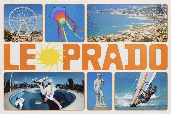
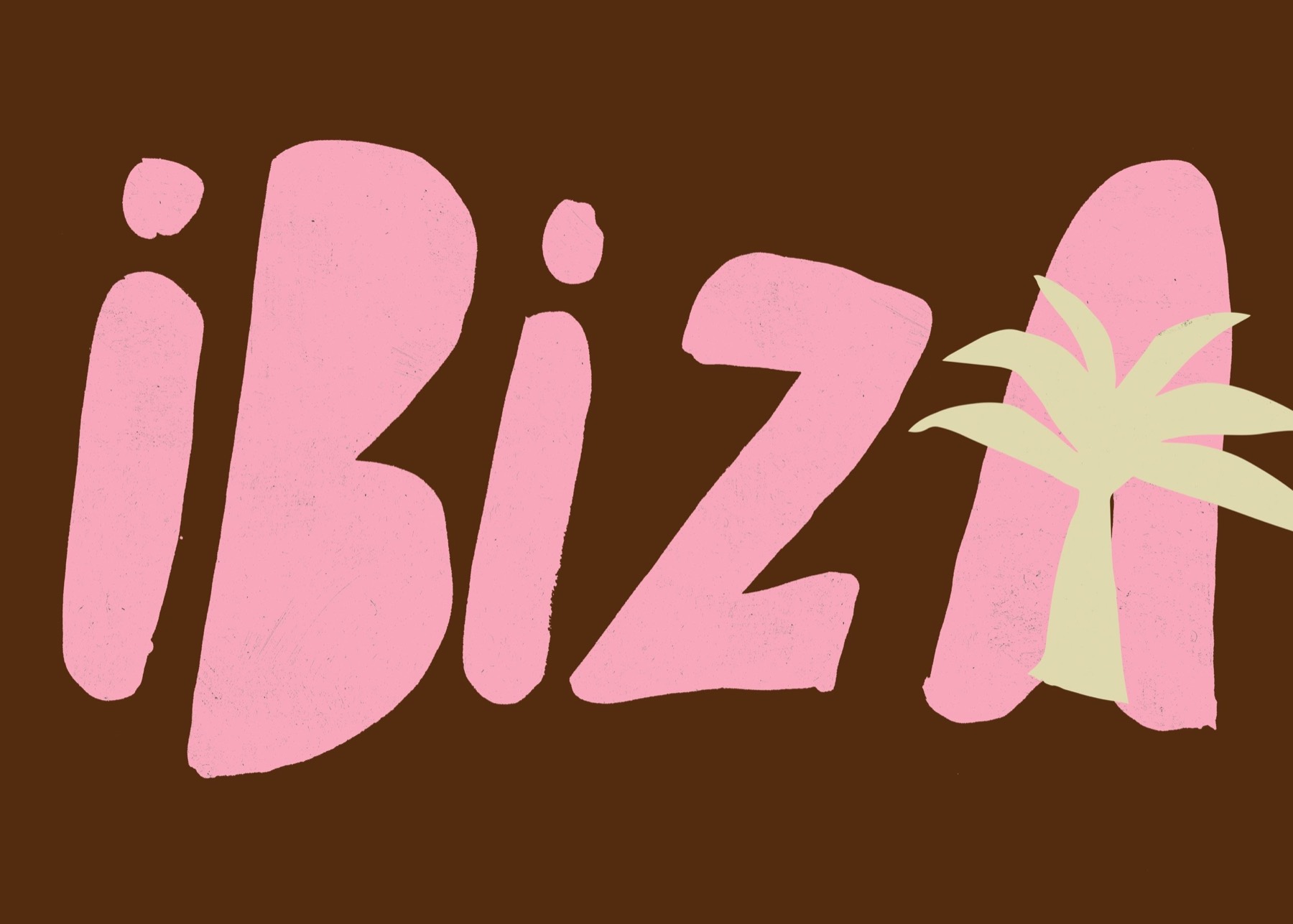
Most of these are basically a place name and a picture. When where you are is a big part of why people come, it's worth saying it big. All the practical information can live on the website, where people look for it anyway.
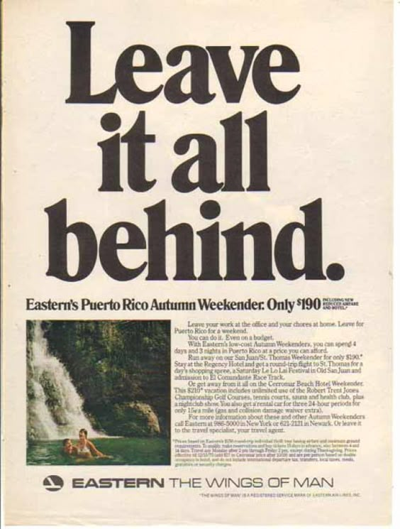
The Eastern Air Lines advert is a nice example of the opposite approach working too, because it's mostly words. But look at what the words say: "Leave it all behind." It's still selling one feeling. It's just doing it in type.
Part 4Why we like what we like
We're interested in places that feel like themselves, not in luxury for its own sake. We'd honestly rather stay in a twelve-room hotel with a very opinionated owner than somewhere enormous and polished. And old travel posters have that same quality. They feel made by someone with an opinion about what mattered.
There's also something about the way they make ordinary things look special. A beach, a pine tree, a boat. It's a bit like William Eggleston's photographs, which Lucy has loved for a long time, where the colour is really the subject and something you'd walk straight past suddenly becomes the most interesting thing in the frame.
Part 5Then print it
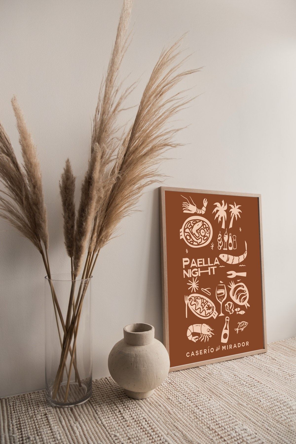
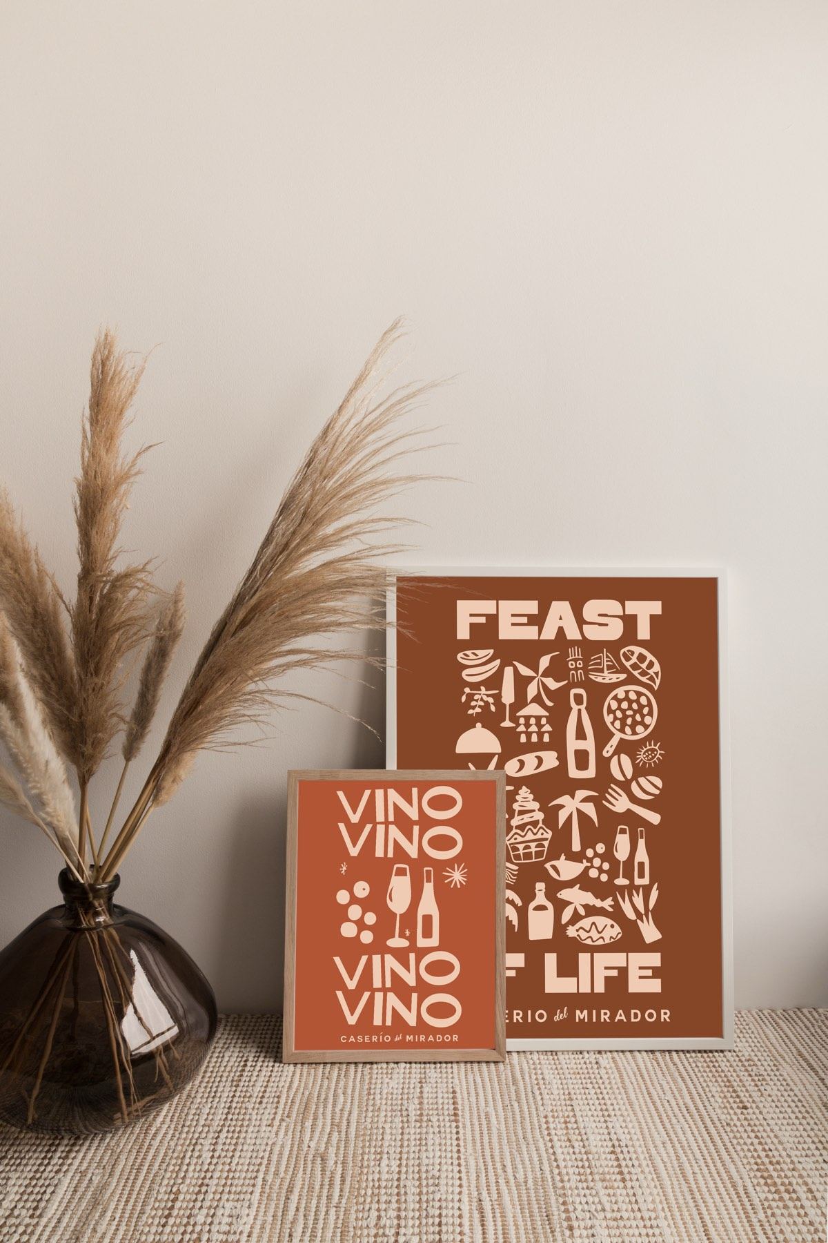
A poster is one of the few branded things a guest will happily pay to take home. It's also, if you think about it, the cheapest piece of marketing you'll ever sell: it goes on someone's wall and gets looked at every day. We made a set for Caserío del Mirador, a family retreat in the Jalón Valley, and the paella night poster is one of our favourite things we've done for them.
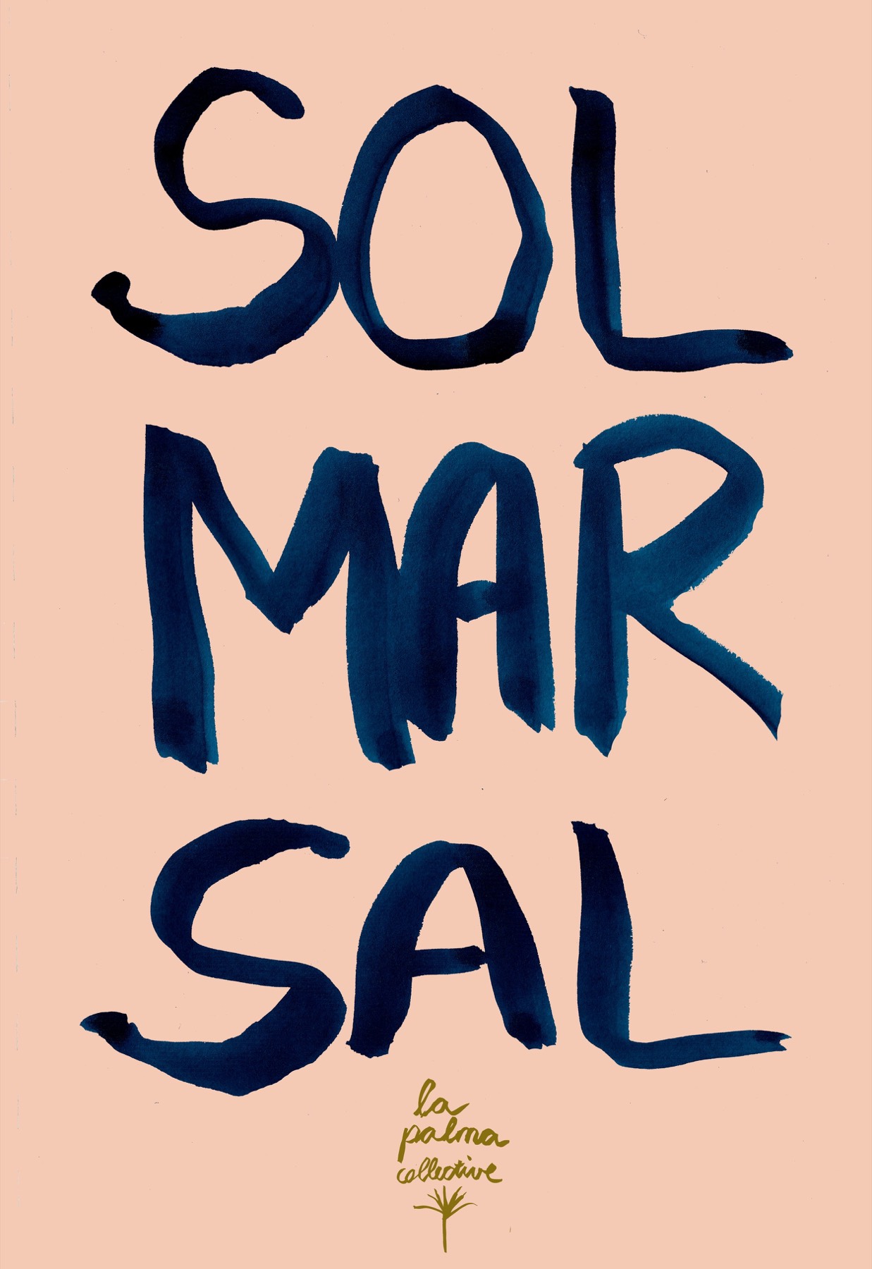
And it doesn't have to be a hotel. Some of Lucy's own La Palma Collective prints started from exactly this feeling: three words and a colour that tells you where you are.
More on our Vintage Graphic Design board.