- Bigger than feels comfortable
- Mixing type, on purpose
- Hand-made letters
- Make a series
- Why we like what we like
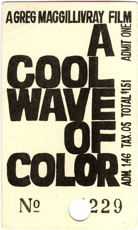
Event posters used to be pasted on walls and read from across the street, so the type had to be enormous. Somebody walking past had about two seconds to take in what was happening, where and when. And we still love that. There's something so confident about a poster where the words take up the entire page.
We look at a lot of these, and it's made us quite opinionated about event graphics. A supper club, a live music night, a long lunch or a market day deserves a poster you could read from the car.
Part 1Bigger than feels comfortable
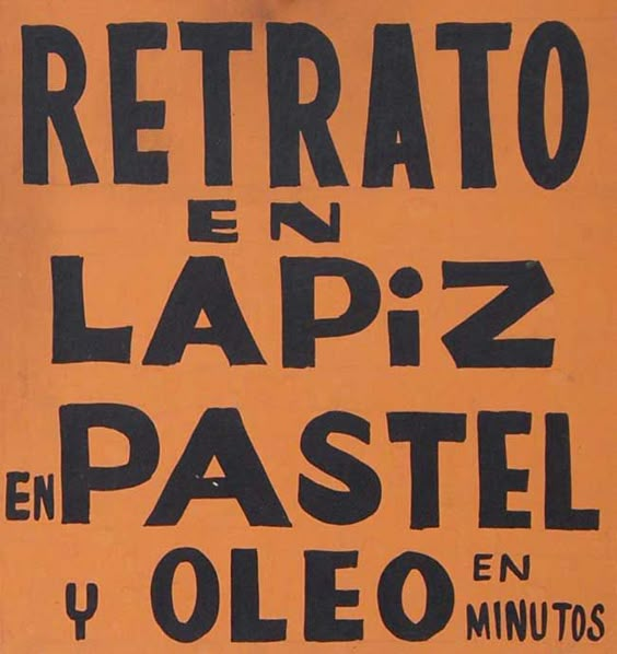
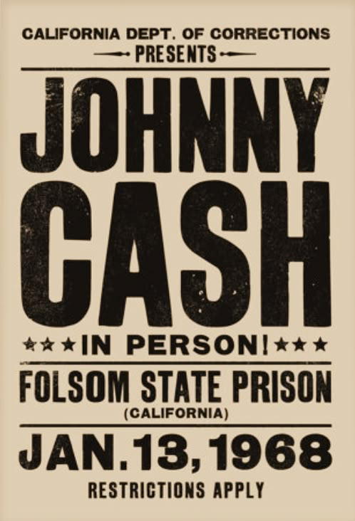
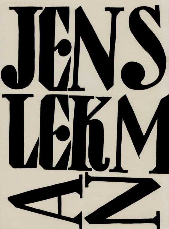
Look at "Retrato en lápiz, pastel y óleo". It's just an offer for portraits in pencil, pastel and oil, and the letters are so big they're practically falling off the page. The Johnny Cash poster is the same: the name is the poster.
Whatever size you've made your headline, it can probably go bigger. When we design posters for clients, the most common note we give ourselves is "bigger". The name of the night and the date are all anyone needs from a distance. Everything else can be small.
Part 2Mixing type, on purpose
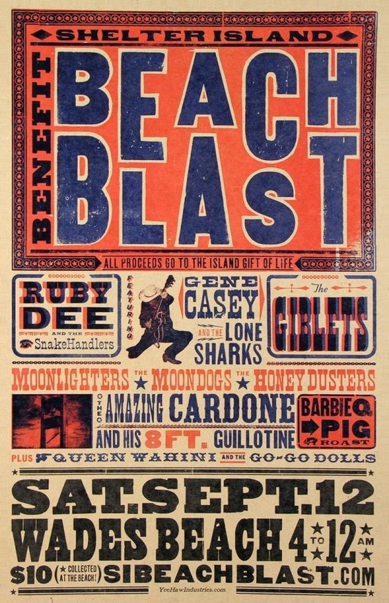
The Beach Blast poster uses about eight different typefaces and somehow it works. That's the old letterpress printers using whatever wood type they had in the drawer. It feels joyful and a bit chaotic, which is exactly right for a beach party.
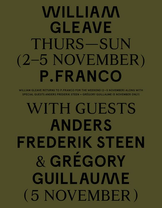
If you want a calmer version, the olive poster with the long list of guests is a good one to look at. One tall condensed typeface, used in different sizes, in one colour on one colour. It's still bold, just more grown up.
Part 3Hand-made letters
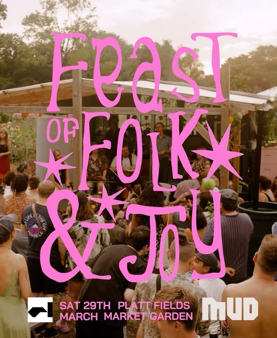
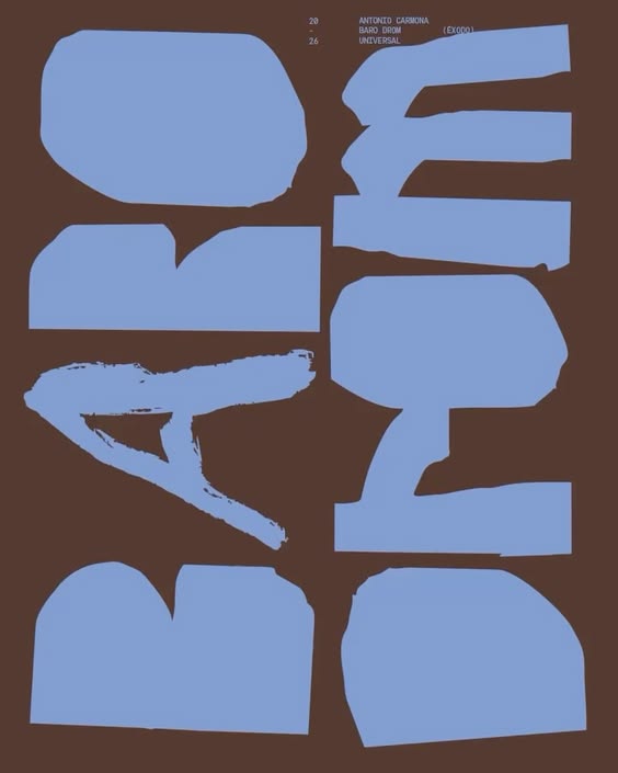
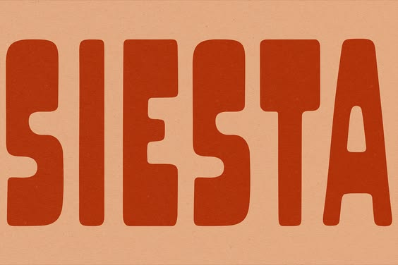
A lot of our favourites have lettering that's been drawn rather than typed. The Feast of Folk & Joy poster is pink hand lettering straight over a festival photograph. Baro Drom is big soft letters that look cut out of paper. Siesta is a whole typeface that feels like it's been painted on the side of a shop.
Hand lettering is a really easy way to make something feel specific to one place and one night. It doesn't need to be perfect. In fact it's usually better if it isn't.
Part 4Make a series
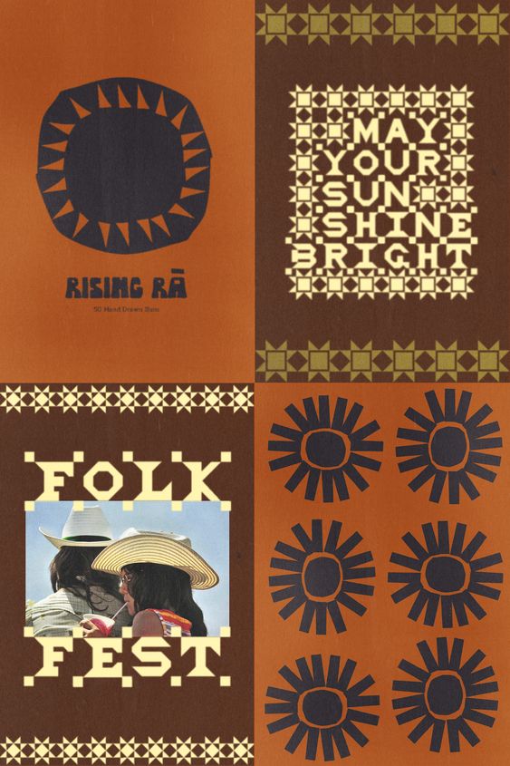
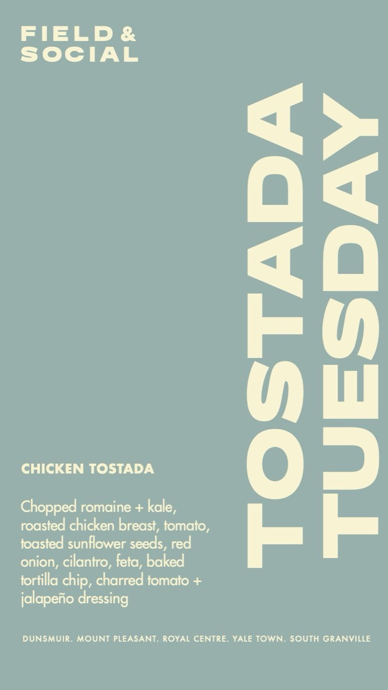
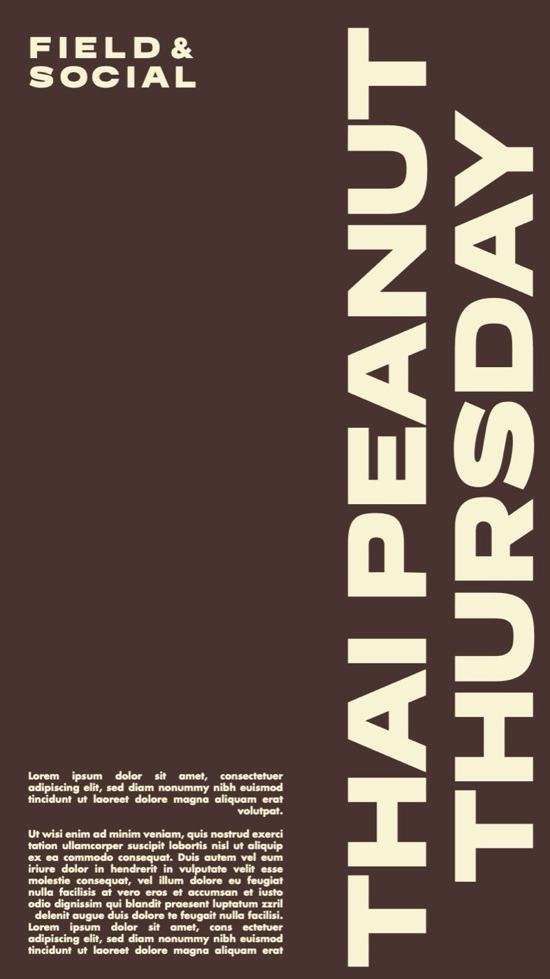
If you run something every week or every month, design a system rather than a one-off. Same layout, same typeface, a new colour and a new name each time. People start to recognise it, and by the third one they're looking out for it. It also makes life much easier for whoever has to make the next poster on a Tuesday afternoon.
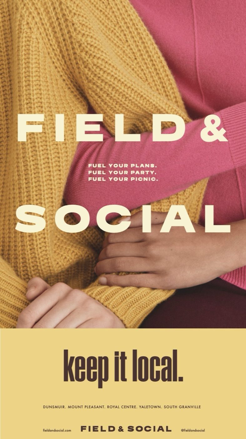
We did something like this with Field & Social in Vancouver, where each day of the week has its own dish and its own line, so the posters and stories feel like a series you can follow.
Part 5Why we like what we like
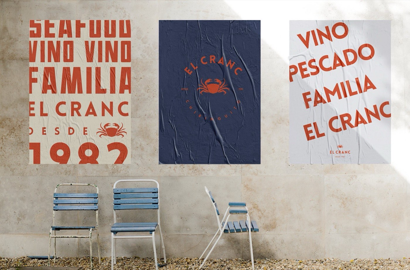
We like confidence. Not shouting for the sake of it, but a clear idea delivered without apologising. A poster that takes up the whole wall with one word has made a decision, and we find that really attractive, in design and in places.
We also like type that has a personality. A lot of modern branding uses very neat, very safe, very similar fonts, and it all starts to blur together. These posters remind us how much character type can have.
Planning events this season? Tell us about them. And there's plenty more on our Graphic Design board.