- Andiamo: write it like you'd say it
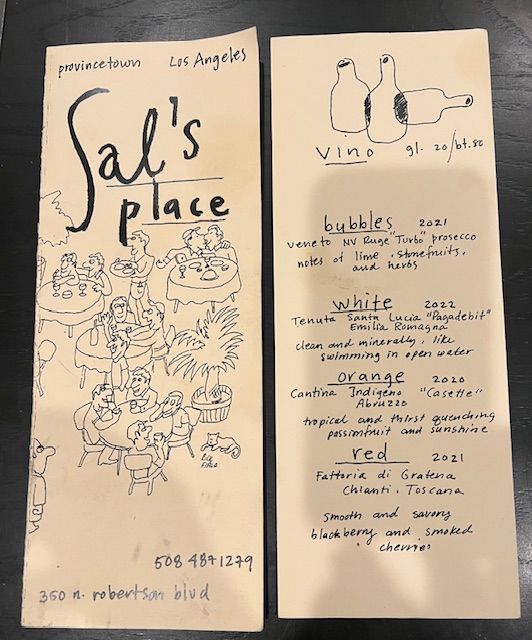
- Sal's Place: hand-drawn is allowed
- One loud thing, everything else quiet
- The paper matters more than you'd think
- Why we like what we like
- A few of ours
We are the people who care what the menu is printed on. We'll pick it up, feel the paper, look at the type, notice whether the prices are lined up or not, and only then actually read what there is to eat. It's not the most relaxing way to have dinner, but it does mean we've seen a lot of menus, and we've saved the ones that stuck.
What they have in common isn't a style. Some are hand-drawn, some are very strict and typographic, some are a bit chaotic. What they share is that each one clearly belongs to its restaurant. You could cover the name and still guess what kind of place it is.
Part 1Andiamo: write it like you'd say it
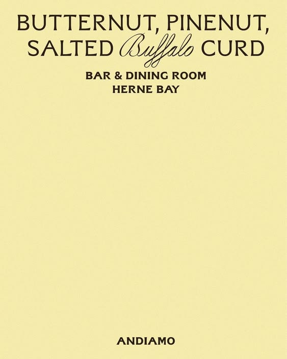
"Butternut, pine nut, salted buffalo curd." No adjectives, no little story about where the squash was grown. Just three things you want to eat, set in a type that feels warm and slightly old-fashioned on a pale yellow card.
We think short, specific dish names are almost always better than clever ones. When a menu tries too hard ("a symphony of", "our take on", "kissed with"), people stop trusting it. When it just tells you what's on the plate, it sounds like a kitchen that's confident in the food.
Part 2Sal's Place: hand-drawn is allowed
The Sal's Place menu looks like someone drew it at the bar before service. Little sketches, wobbly lines, crossings-out that might be real. It tells you this is a relaxed place where the menu changes often, without saying either of those things.
The practical side of hand-drawn menus is really nice too. You can photocopy them. You can change them every week. It suits a small place with a short, seasonal menu much better than an expensive printed one that's out of date in a month.
Part 3One loud thing, everything else quiet
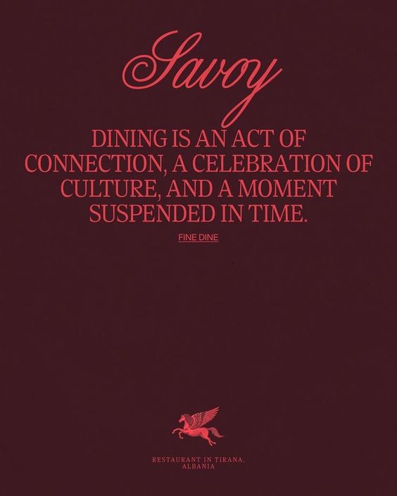
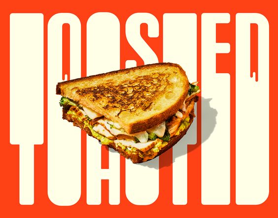
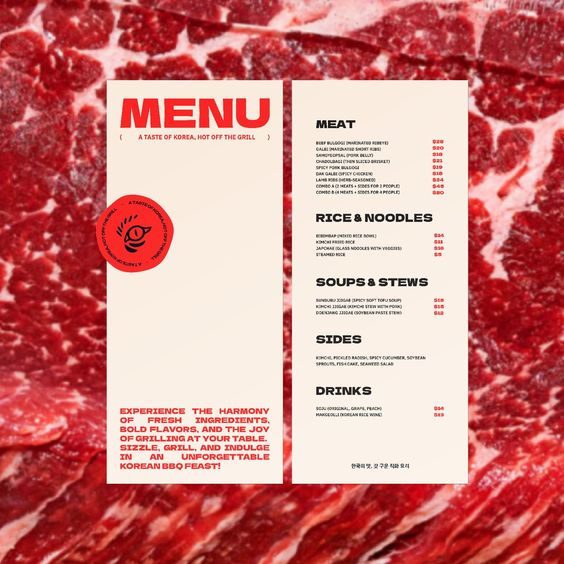
The menus we like best choose one thing to be loud about. Toasted is a giant sandwich and enormous letters. The steak menu printed over a photograph of marbled beef is honestly a bit much, and that's why it's memorable. Savoy is that deep red and very elegant serif type.
But in all of them, the bit you actually need to read (the dishes and the prices) stays calm. That's the balance. Be as bold as you like with the cover, the colour or the headline, then make the information clear and easy.
Part 4The paper matters more than you'd think
A menu is something people hold, often for quite a long time, so the material is part of the experience. Thick card feels generous. Thin paper on a clipboard feels casual and changeable. A menu in a plastic sleeve tells you something too, and usually not what the restaurant wanted.
It's also worth thinking about the real conditions it'll be read in. A menu that looks lovely on a screen in the studio can be impossible to read by candlelight, or covered in olive oil by Saturday night. We always print tests and look at them in the actual room, at the actual time of day, before anything gets signed off.
Part 5Why we like what we like
We think it's because a good menu is such an honest piece of design. It has to work. It has to be read quickly, by people who are hungry and chatting and maybe in a slightly dark room. There's nowhere to hide. And when it's done well, it's the first real taste of the restaurant, before the food arrives.
Lucy says it best about the things she loves: "I think it's the thing that's beautiful." She was talking about handbags, but it's true of menus. We don't care if it's expensive. We care if somebody thought about it.
Part 6A few of ours
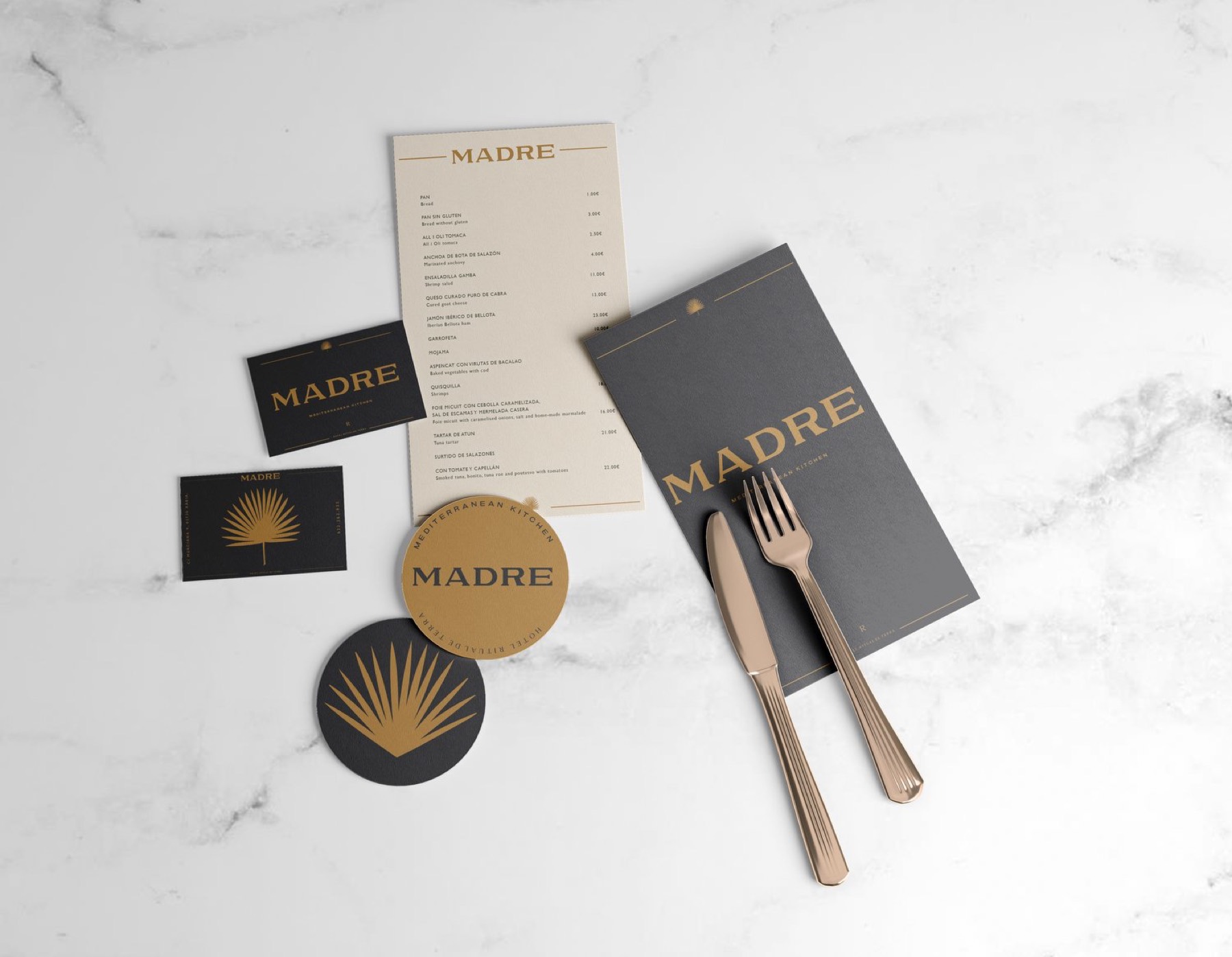
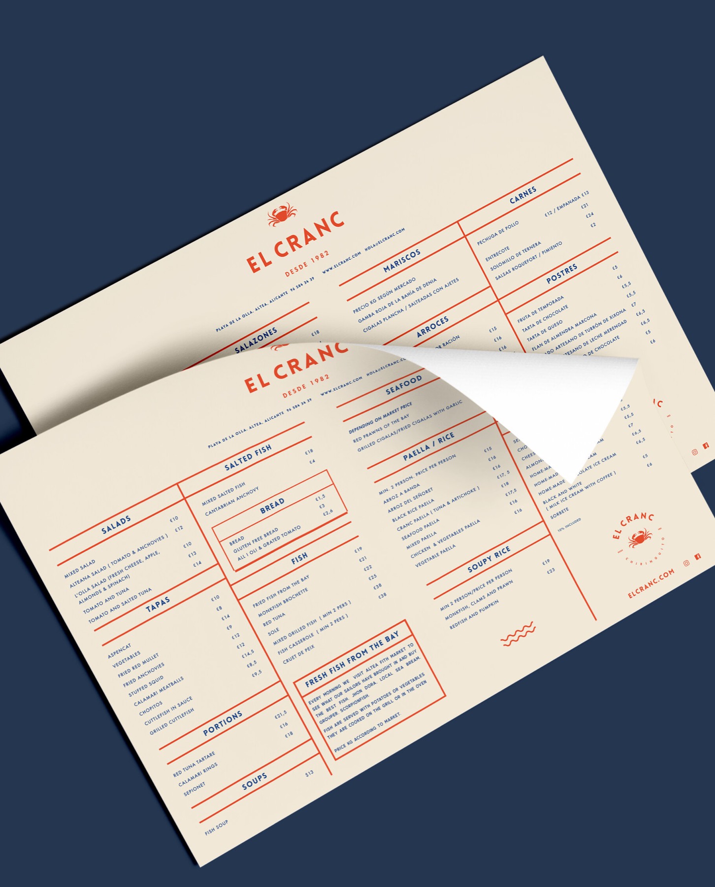
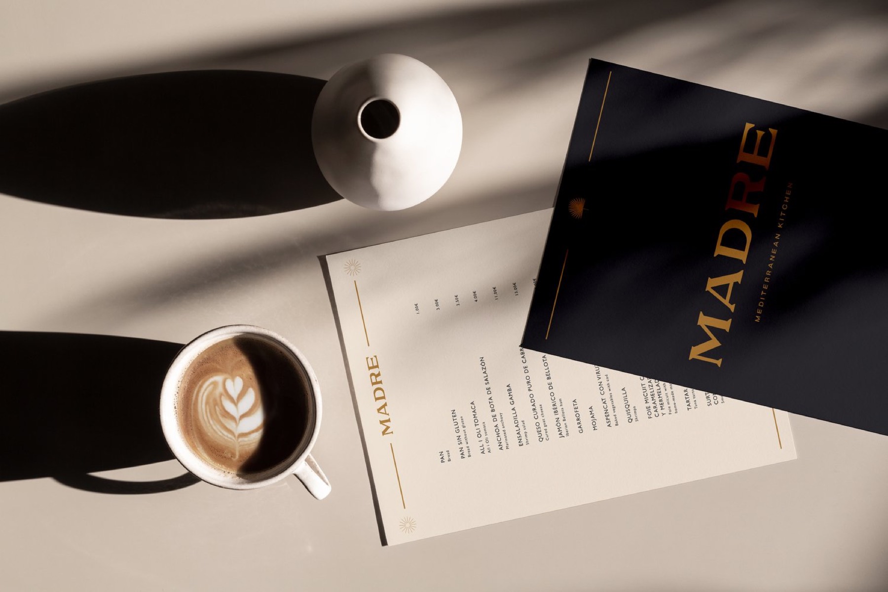
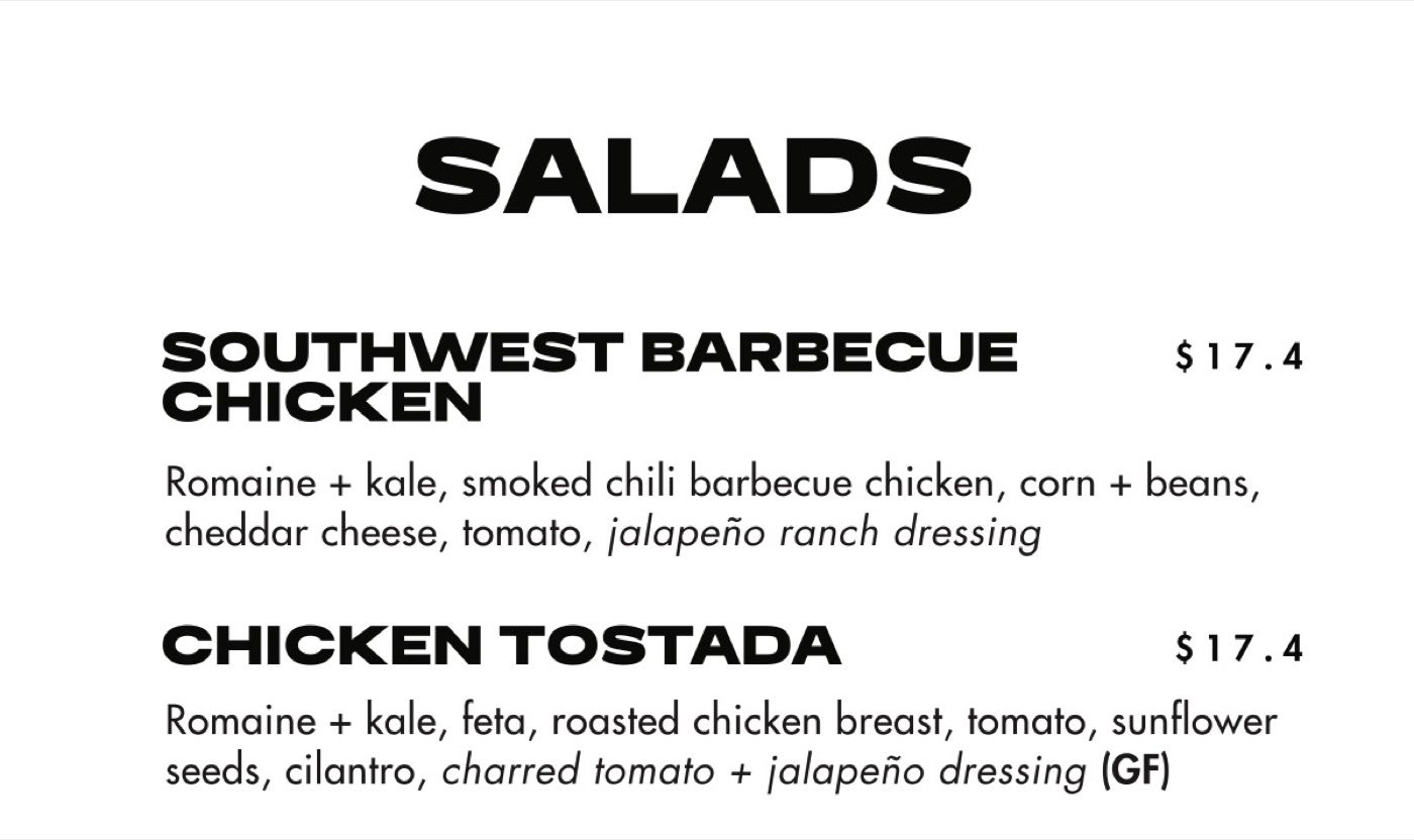
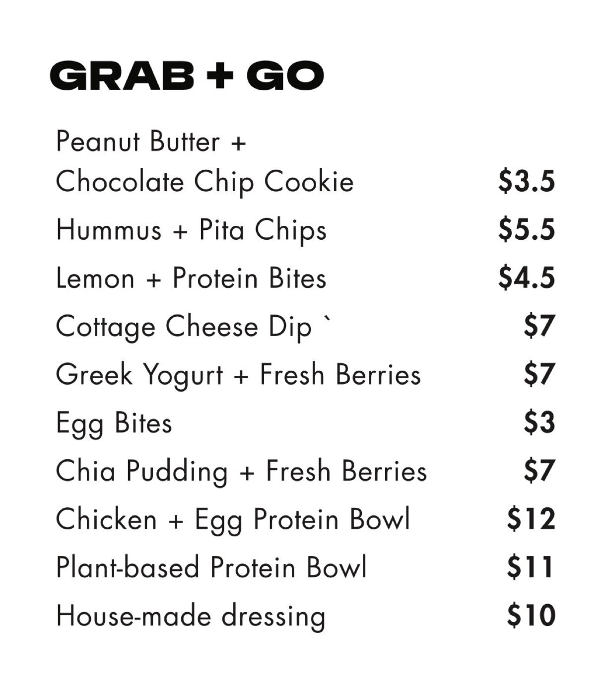
For El Cranc, a beach chiringuito, the menu is printed on cream paper in red, like a ticket you'd get handed at the bar. For Madre it's darker and quieter, to match the room. For Field & Social in Vancouver, menus are only one part of a much bigger system that runs across salads, screens and magnets.
Thinking about a new menu? Read what guests notice before they order, which has a full menu checklist, or talk to us.