- One idea, done properly
- The address is part of the design
- Made to be taken home
- Why we like what we like
- What you could steal
We have a slightly embarrassing number of matchbooks saved on Pinterest. Some of them are for places that closed decades ago, in cities we've never been to, and we still look at them more often than we look at most current restaurant branding. So we thought it was worth working out why.
Part of it is just that they're lovely objects. But mostly it's that a matchbook had a job to do and very little space to do it in. It had to say the name, say where you were, and make you want to come back, on something about the size of a business card that somebody would probably drop in a handbag and forget about. That kind of constraint makes design really honest. You can't hide a weak idea behind a lot of nice photography.
Part 1One idea, done properly
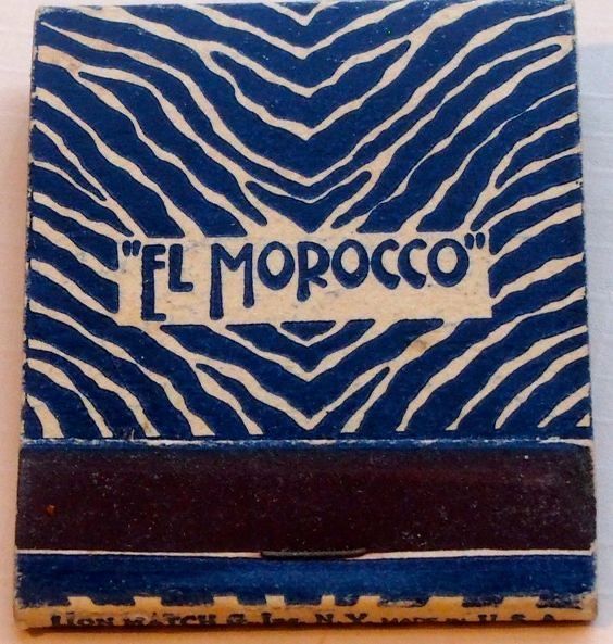
El Morocco had the zebra stripe. That's basically it. No tagline, no list of what they served. And it worked so well that the stripe became the place: the banquettes, the photographs, the matches. If you saw that stripe anywhere, you knew where it came from.
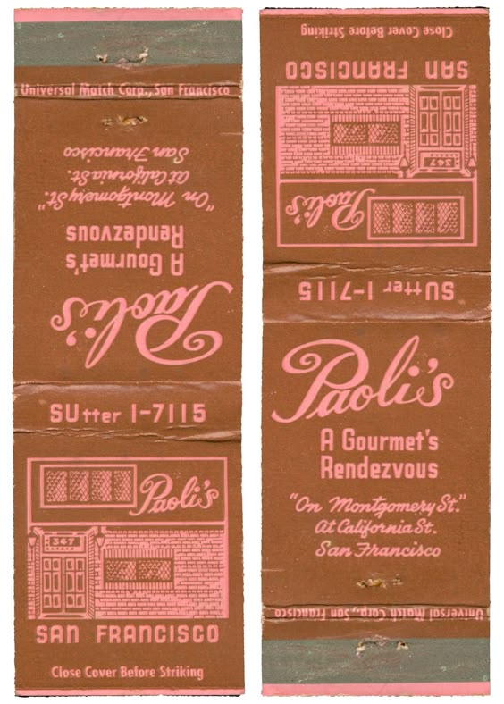
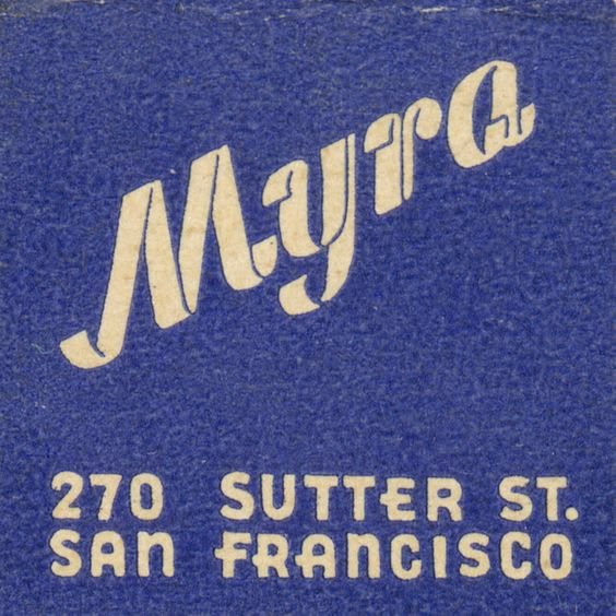
When we start a restaurant identity, this is honestly the thing we're looking for before anything else. Not a logo yet, but the one thing: a pattern, a colour, a word, a drawing. Something you'd recognise from across the room, or from a corner of a photo on someone else's Instagram. Myra does it with one swooping script word on a flat blue. Paoli's does it with a colour pairing (that brown and pink together is so good) and lettering that feels like it was drawn by hand for that exact name.
The test we use is simple: if you only had the matchbook, and nothing else, would you know what kind of night you were going to have? With all of these, you would.
Part 2The address is part of the design
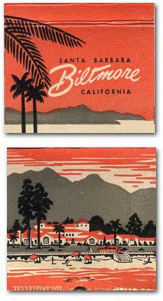
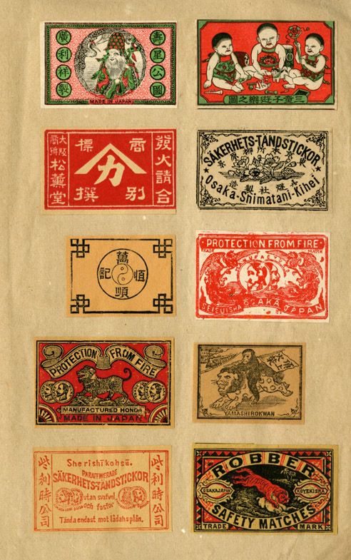
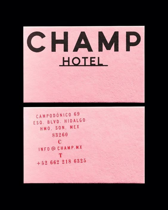
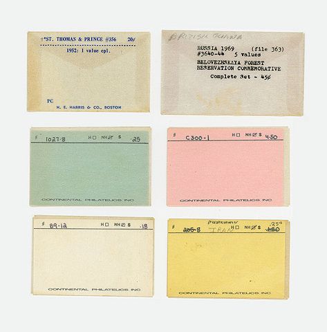
This is the bit we find most interesting, and most useful. So many of these put the address and phone number right on the front, and they set it beautifully. "270 Sutter St, San Francisco" on the Myra matchbook isn't small print. It's part of the composition.
Today the practical stuff usually gets treated as an afterthought: the address goes in a tiny line at the bottom of the menu, the opening hours live on Google, and the Instagram handle gets squeezed in wherever there's room. But that information is genuinely useful to people, and if you design it properly it becomes part of your identity. A beautifully set address on a card, a door, an awning or a bag tells people you're proud of where you are.
Part 3Made to be taken home
A matchbook was free. You took it on the way out without thinking, and then it lived in a kitchen drawer for years. Nobody really uses matches like that any more, but the idea behind them is still one of the best bits of restaurant marketing there is: a small, cheap, beautiful thing that leaves with the guest.
The modern versions we like are things like a printed sugar sachet, a postcard with the menu on the back, a little card with the address, a coaster, a napkin with something drawn on it. They cost very little per piece, and they do something no advert can do, which is end up in someone's home, or in a photo of their dinner, or handed to a friend with "you have to go here".
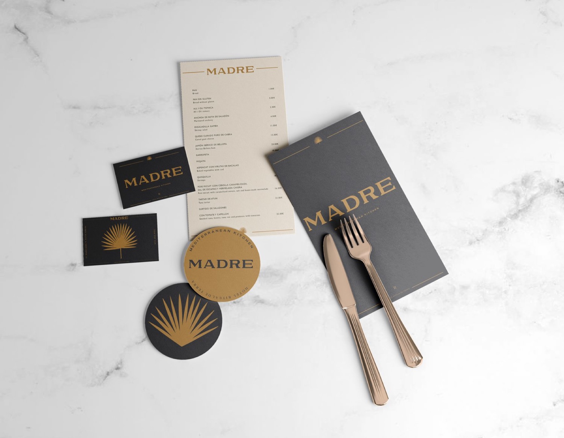
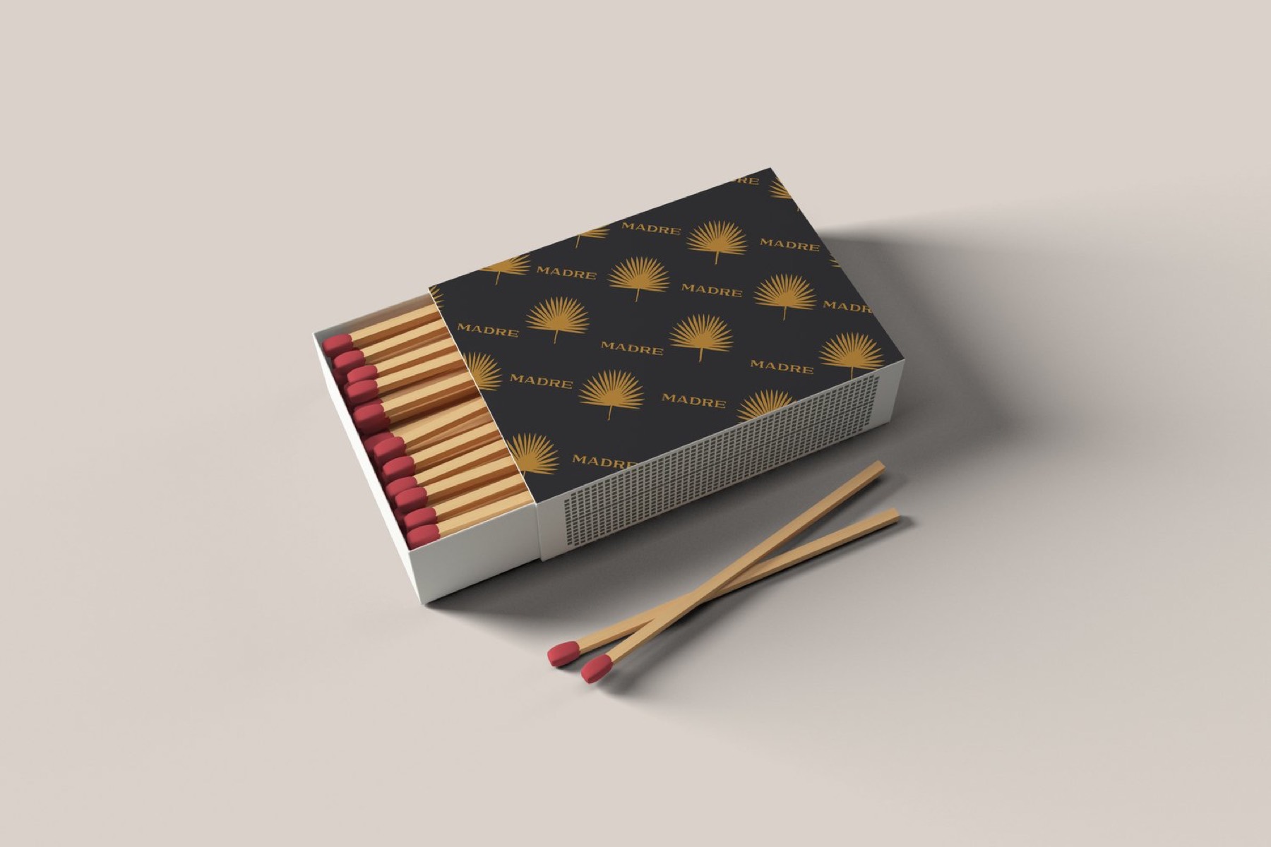
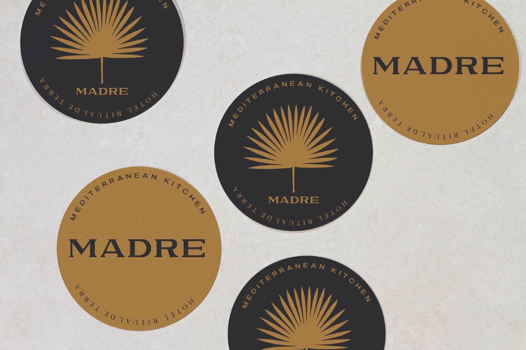
We designed matchboxes for Madre, and the coasters too. Not because anyone needed matches, but because those little pieces carry the palm pattern out of the restaurant and into people's pockets.
Part 4Why we like what we like
If we're honest, the reason these get saved is the same reason we notice the menu, the chairs and the glasses before we've ordered anything. We like things where somebody clearly cared about a small detail that they didn't have to care about. A matchbook is a tiny thing that nobody would have complained about if it had been plain. Somebody made it beautiful anyway.
We also like that they're not trying to look expensive. They're confident, sometimes a bit funny, sometimes a bit odd. They feel like a particular place made by particular people, which is what we're always trying to get to with the restaurants we work with.
Part 5What you could steal
If you run a restaurant or bar, here's what we'd take from all this. Choose your one thing and use it everywhere, even somewhere small. Set your address and details as if they matter, because they do. And make at least one small object that people can take home for free. It doesn't have to be matches. It just has to be something nice enough that they don't throw it away.
We keep a whole board of these. Follow along on Pinterest, or see more on our inspiration page.