- Say what it is
- Leave room for a joke
- Type that's friendly, not fancy
- Why we like what we like
- Some of ours
- If you make something
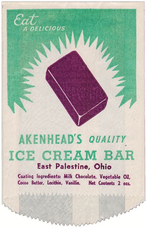
Nobody was precious about an ice-cream wrapper. It was going to be torn open and thrown away in about thirty seconds. And maybe that's why so many of them are brilliant. Big friendly type, a drawing of the product, one or two colours, and a little joke if there was room.
We save a lot of old packaging, and the pieces we keep coming back to aren't the luxury ones. They're the everyday things: wrappers, labels, paper bags, matchboxes, soap. Things that were made cheaply and quickly, and still turned out lovely.
Part 1Say what it is
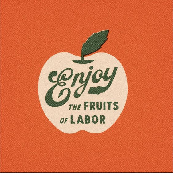
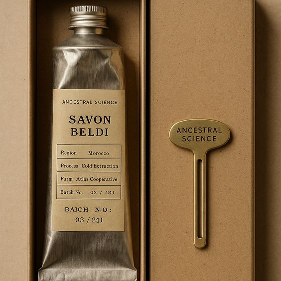
Most of these don't hide the product behind a mood. There's a picture of the ice lolly. A drawing of the apple. Akenhead's just shows you the bar. Today a lot of packaging is so busy trying to look minimal and premium that you can't tell if it's shampoo or olive oil.
If you make something lovely, we think you should show it, and let the type and colour do the charming. It's more honest, and honestly it's usually more beautiful too.
Part 2Leave room for a joke
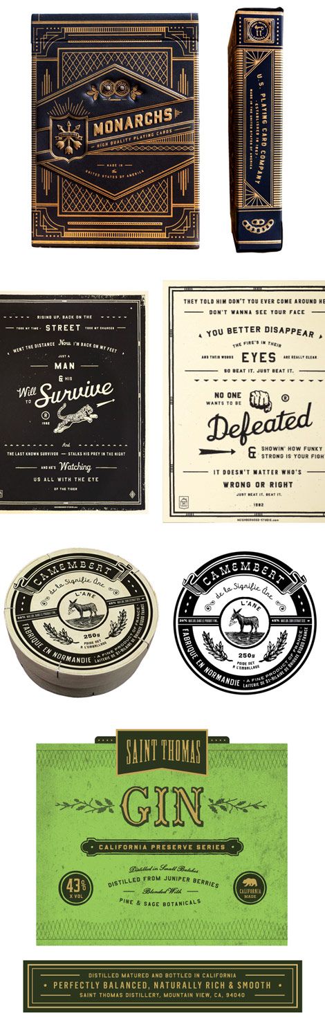
"Enjoy the fruits of labor" on a fruit crate label. It's such a small thing, but it's the reason that label gets saved and shared, decades later. A bit of wit on packaging costs nothing, and it's often the thing people remember and photograph.
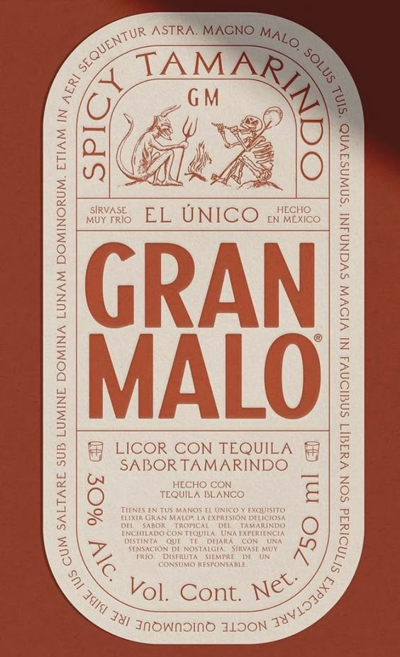
It doesn't have to be a pun. It can be a funny drawing, an unexpected colour, a line on the inside of the box that you only find when you open it. The point is that somebody had fun making it, and you can tell.
Part 3Type that's friendly, not fancy
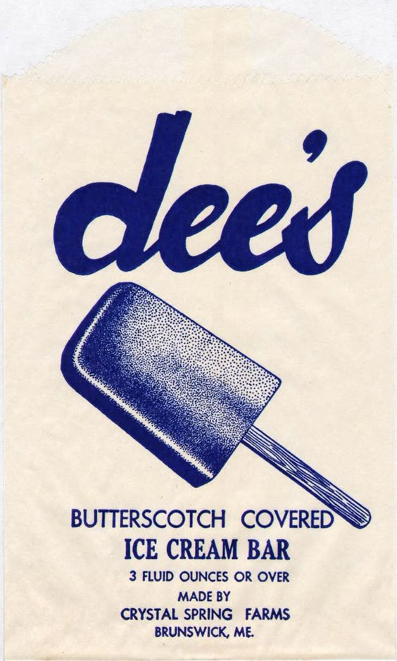
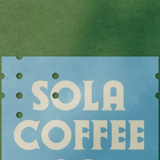
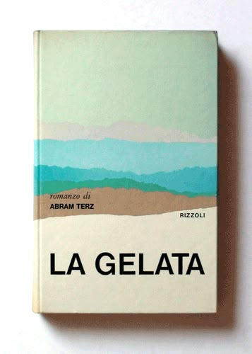
So much of the type on old packaging is round, warm and a bit wonky. Sola Coffee is basically big soft letters on a pale blue. The Dee's wrapper has script that looks like it was drawn by someone who liked ice cream. None of it is trying to look expensive. It's trying to look nice to be around, which is a very different thing.
Part 4Why we like what we like
We like beautiful things, but we don't want everything to look expensive. That's true of homes and it's true of brands. Old everyday packaging is the perfect example of that: it's beautiful, it's useful, it's often funny, and it was made to be ordinary.
And there's that same thread that runs through everything we save. Somebody cared about a small thing that nobody would have complained about if it had been plain.
Part 5Some of ours
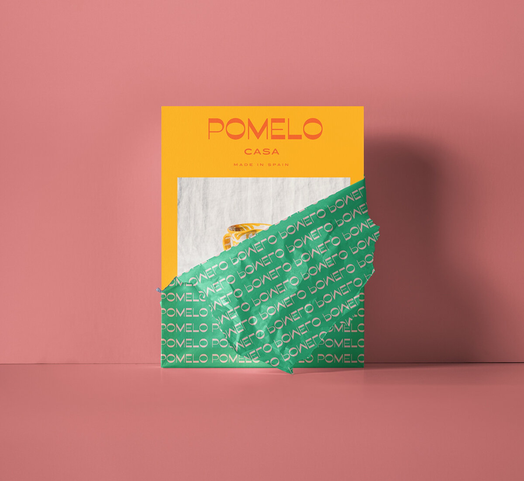
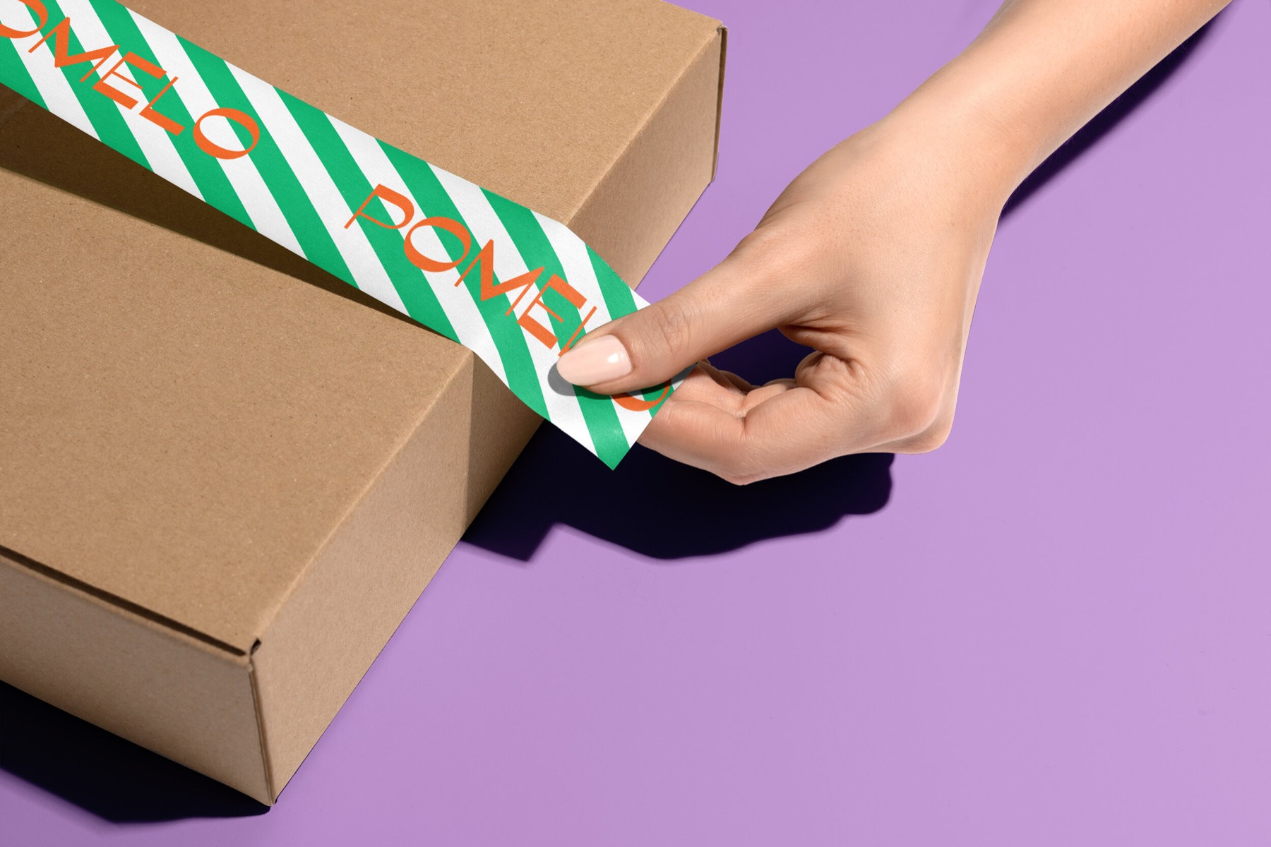
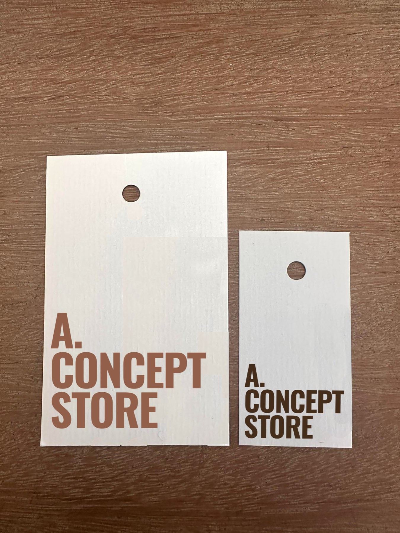
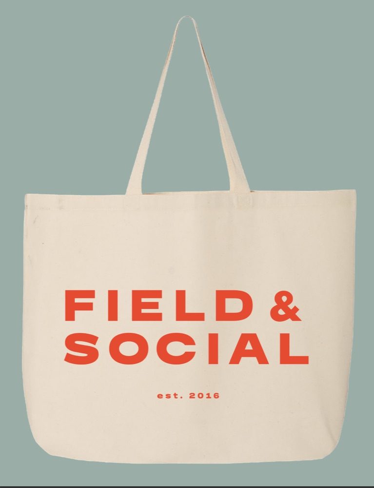
For Pomelo Casa, which sells handmade Spanish ceramics, we went all the way down to the tissue paper and the tape. Green stripes, "Hola!" in big pink letters, "Less plastic, more ceramic". Opening the box is part of the gift. For A. Concept Store the swing tags and boxes are plainer, but they carry a line in the same voice as the shop.
Part 6If you make something
Look at your packaging as if you were the customer opening it at home. Is there anything you'd want to keep? Is there anything that made you smile? Is it obvious what's inside? If the answer to all three is no, that's probably the easiest place to start.
If your packaging feels like an afterthought, let's talk.