- The symptoms
- Find the thing only you can say
- Write it down on one page
- Then make it consistent everywhere
- Refresh, or start again?
- A quick test
We see it all the time. A lovely Instagram grid, nice colours, everything matching, good photography. And yet you scroll past and can't remember a single thing about it. Beautiful is not the same thing as memorable.
It's become very easy to make things look nice. There are templates for logos, websites and feeds, and they're often perfectly attractive. The problem is that everyone has access to the same ones, so a lot of independent businesses end up looking expensive and identical. Distinctive is much harder than expensive-looking, and it's much more valuable. This guide is about how to get there.
Part 1The symptoms
It's worth being honest about whether this is you. Some signs that your brand looks nice but isn't saying much:
- If you covered your logo, people couldn't tell your posts apart from three competitors.
- Your "about" section could describe almost any business in your category ("passionate about quality", "a curated selection", "an unforgettable experience").
- Customers describe you by your location or your product, but never by anything you'd recognise as your personality.
- You've changed your colours or fonts more than once in the last couple of years, chasing a look.
- Your website, packaging, signage and social media all look slightly different, because they were done at different times by different people.
- When someone asks what makes you different, you find it surprisingly hard to answer in one sentence.
None of this means your brand is bad. It usually means the design came before the point of view. The good news is that the point of view is almost always already there. It just hasn't been written down.
Part 2Find the thing only you can say
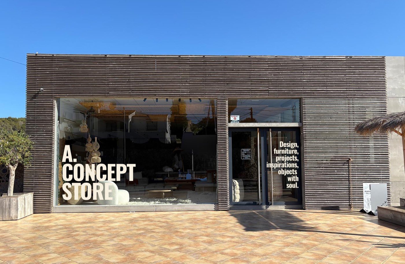
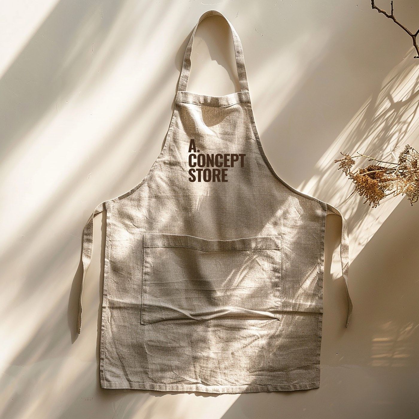
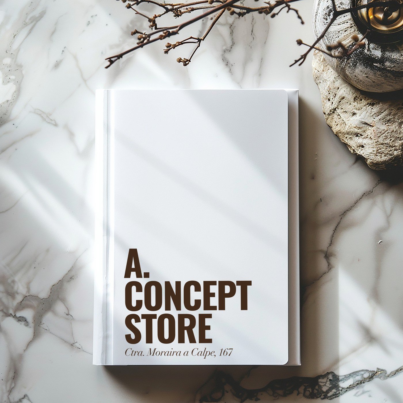
A. Concept Store is a family-run interiors store on the Costa Blanca, shaped by two generations of Belgian taste. The A stands for Antwerp. That one fact did more for the identity than any colour choice could have. It gave us a story, a tone of voice, and a reason for everything to look the way it does.
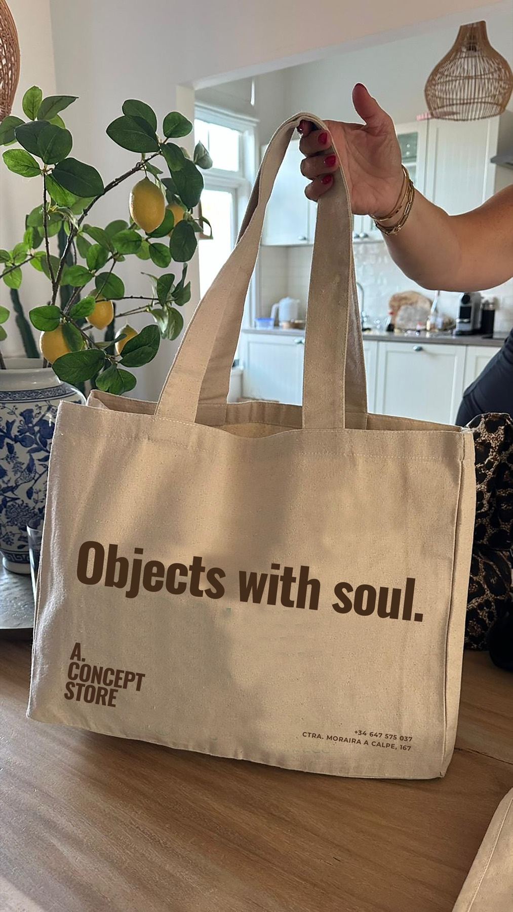
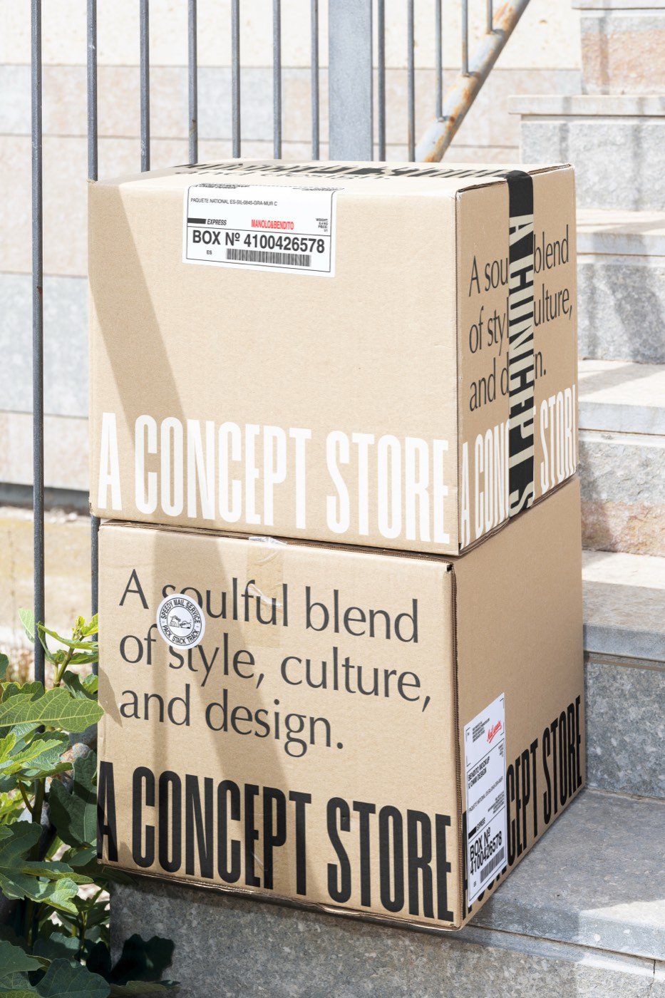
Most businesses have a fact like this. It's often something the owner thinks is boring or obvious. Here are the questions we ask to find it. Try answering them yourself, honestly and in plain language, before you think about design at all.
- Why did you start this? Not the polished version, the real one.
- What do you do differently from the place down the road, even in a tiny way?
- What do you refuse to do, or never sell, or never compromise on?
- What do regular customers love that new ones don't know about yet?
- What's a detail about your history, family, building or location that people find surprising?
- If your business were a person at a dinner party, how would they talk? What would they be wearing?
- What would you be embarrassed to be confused with?
Look for the answers that only you could give. "We care about quality" could be anyone. "The A stands for Antwerp" could only be one shop.
Part 3Write it down on one page
Before you change anything visual, write a one-page brand sheet. It's the most useful document a small business can have, because it means everyone (you, your team, a designer, a photographer, the person writing captions) is working from the same idea. Here's what goes on it.
- One sentence on what you are and who it's for. Plain words.
- Your story in three or four sentences. The real one.
- Three words for how you want people to feel, and three words you never want them to feel.
- Words and phrases you use, and ones you'd never use. (This is your tone of voice, and it's half your brand.)
- Your one thing: the pattern, colour, object, phrase or place that people should recognise you by.
- Your colours and typefaces, with a note on how to use them.
- What good photography looks like for you, with three or four example images, and what it doesn't look like.
Part 4Then make it consistent everywhere
Once you know what you stand for, it should turn up everywhere a customer meets you. Not the same picture everywhere, but the same voice and the same one thing. The photograph, the space, the packaging and the object someone takes home should all feel like they belong to the same place.
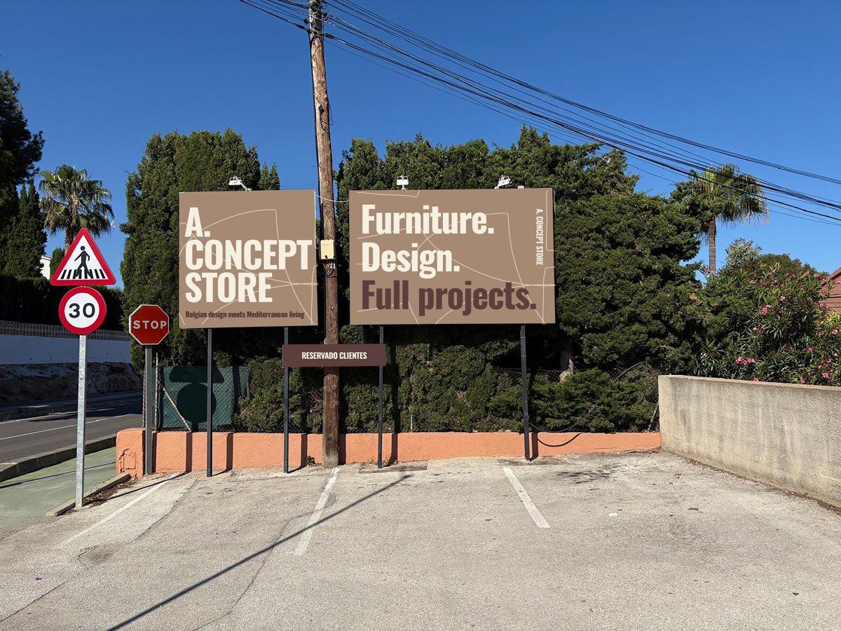
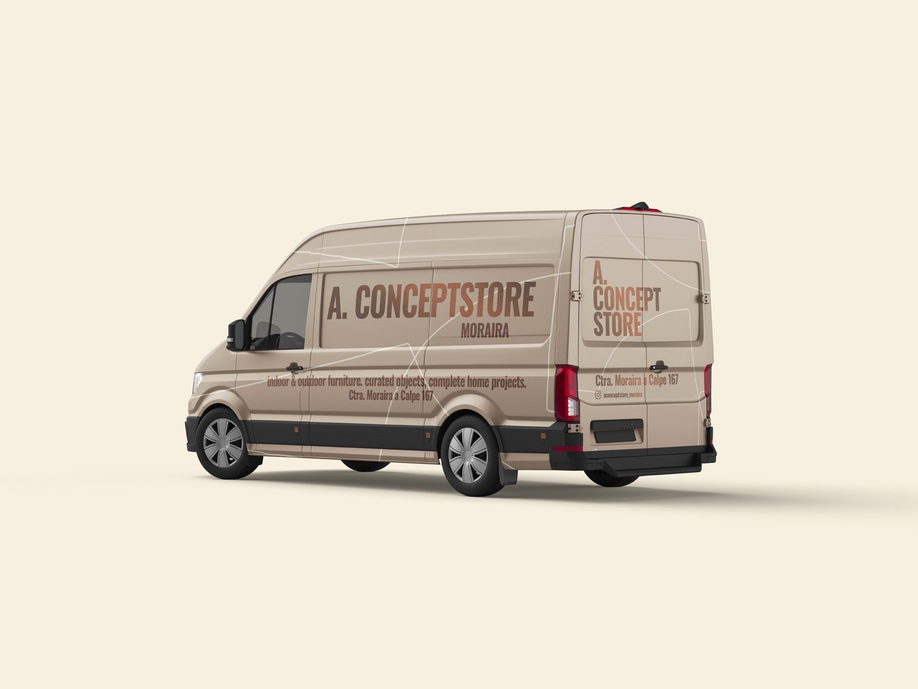
Make a list of every place someone meets your brand, and go through it with your brand sheet in hand. Most businesses are surprised how long the list is.
- Outside: sign, windows, door, awning, van, parking sign.
- Inside: displays, price tags, staff clothing, music, smell, lighting.
- Printed: business cards, menus, tags, receipts, bags, boxes, tissue, stickers, invoices.
- Online: website, Google listing, Instagram bio and highlights, email signature, booking confirmation, newsletter.
- People: how the phone is answered, how emails are written, what staff say when someone walks in.
Part 5Refresh, or start again?
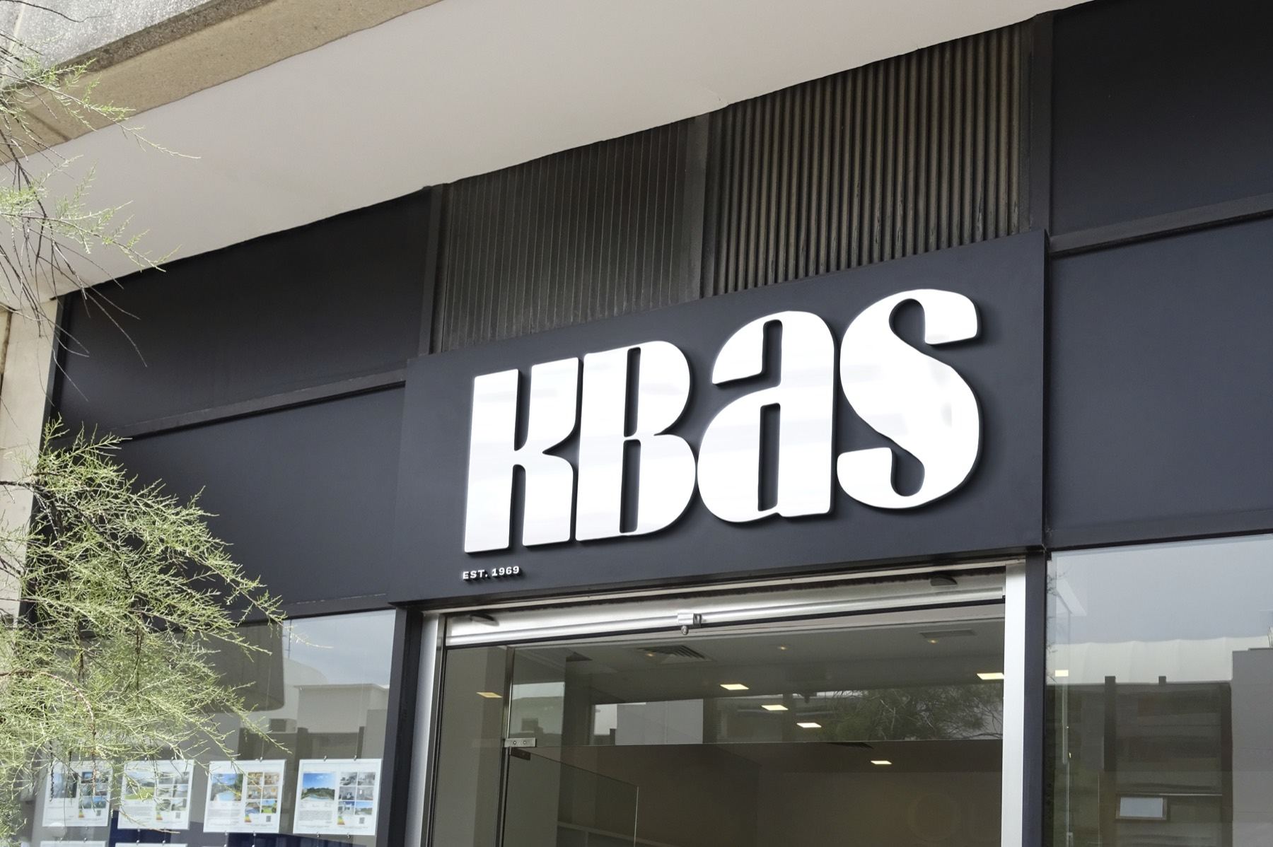
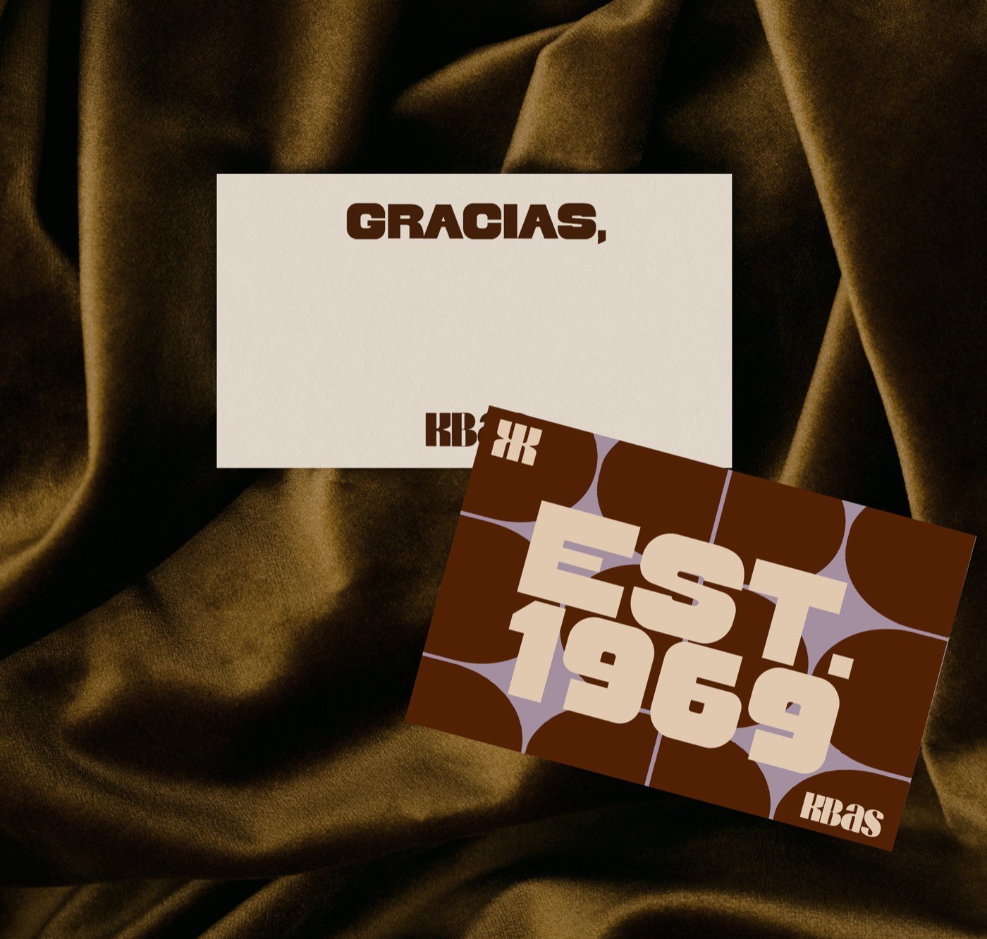
Not every brand needs a full rebrand. Often the right move is a refresh: keep what people already recognise, and make it clearer, more confident and more consistent. KBAS, a Spanish accessories brand with more than fifty years of history, is a good example. We refined the logo, typography and wider visual language, rather than throwing away decades of recognition.
Start again when your name, logo or story is genuinely misleading, when you've changed what you do, or when you're embarrassed to hand over your card. Refresh when people already know you and the bones are good, but it's become inconsistent or dated.
Part 6A quick test
Cover your logo on your last nine posts, your website homepage and your packaging. Would someone who knows you still recognise it as you? If the answer is no, it's not really a design problem yet. It's a point of view problem. And that's usually the more interesting thing to work on, because once it's solved, the design gets much easier.
If you'd like help finding yours, get in touch. Or have a look at how we work.