KBAS
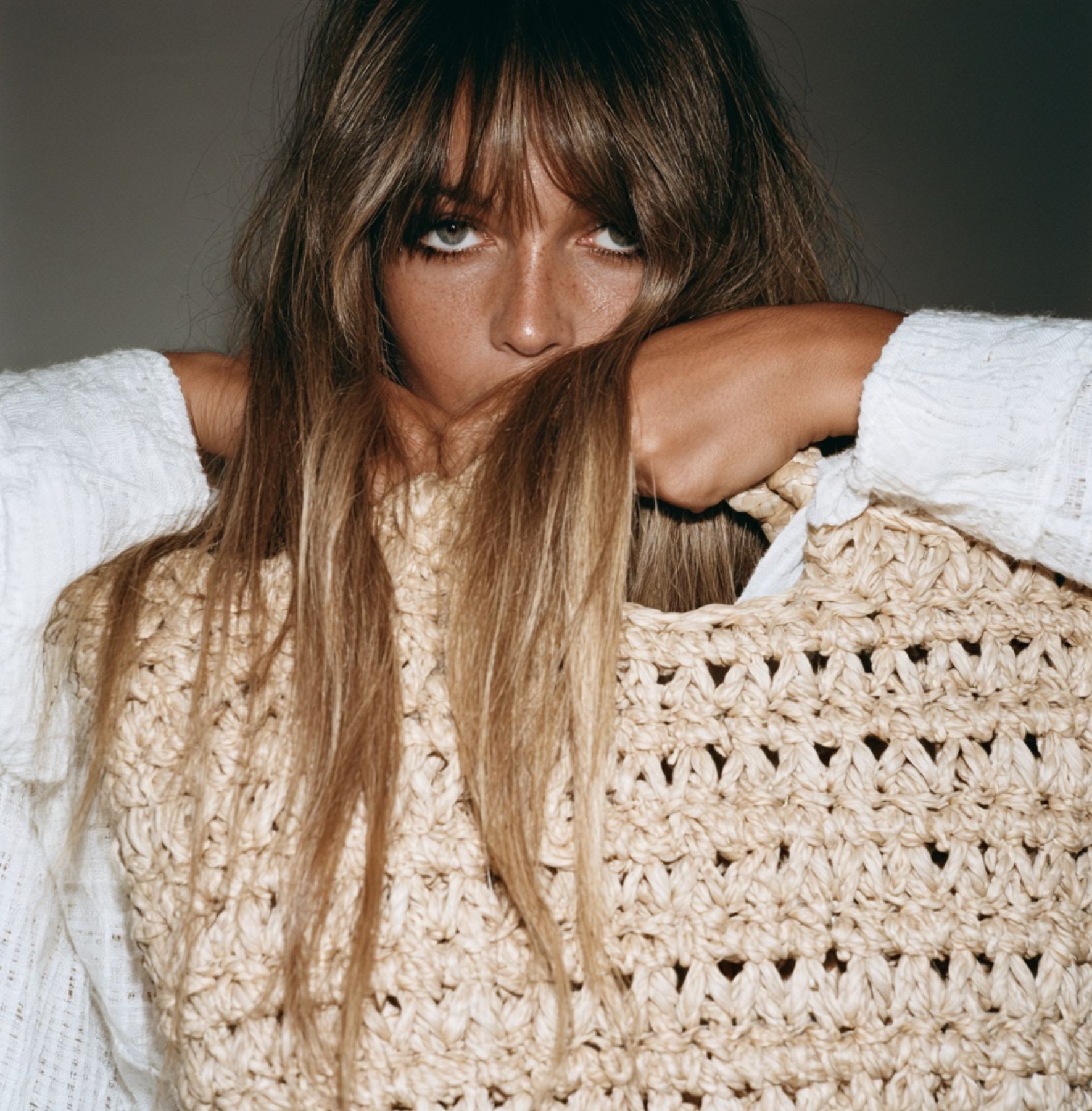
A Mediterranean accessories house from Gata de Gorgos, on the Costa Blanca, making bags, capazos, clothing and home pieces since 1969. A considered refresh for its next chapter: heritage-rooted, never nostalgic.
- Sector
- Fashion accessories
- Location
- Costa Blanca, Spain
- Services
- Brand identity refresh, guidelines, packaging, signage
Not a season. An attitude. The Mediterranean, carried not as a place, but as a way of being.
KBAS has made bags, capazos, clothing and home pieces since 1969, in natural fibres and made to last beyond seasons.
Five decades in, with a younger sister brand, Volum, alongside, it needed an identity as considered as the pieces, and a manual its own team could work from: logo, colour, type, art direction, and every application from swing tags to signage.Statement adapted from KBAS's brand overview, in the guidelines.
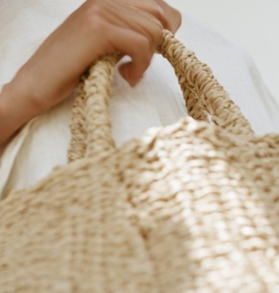
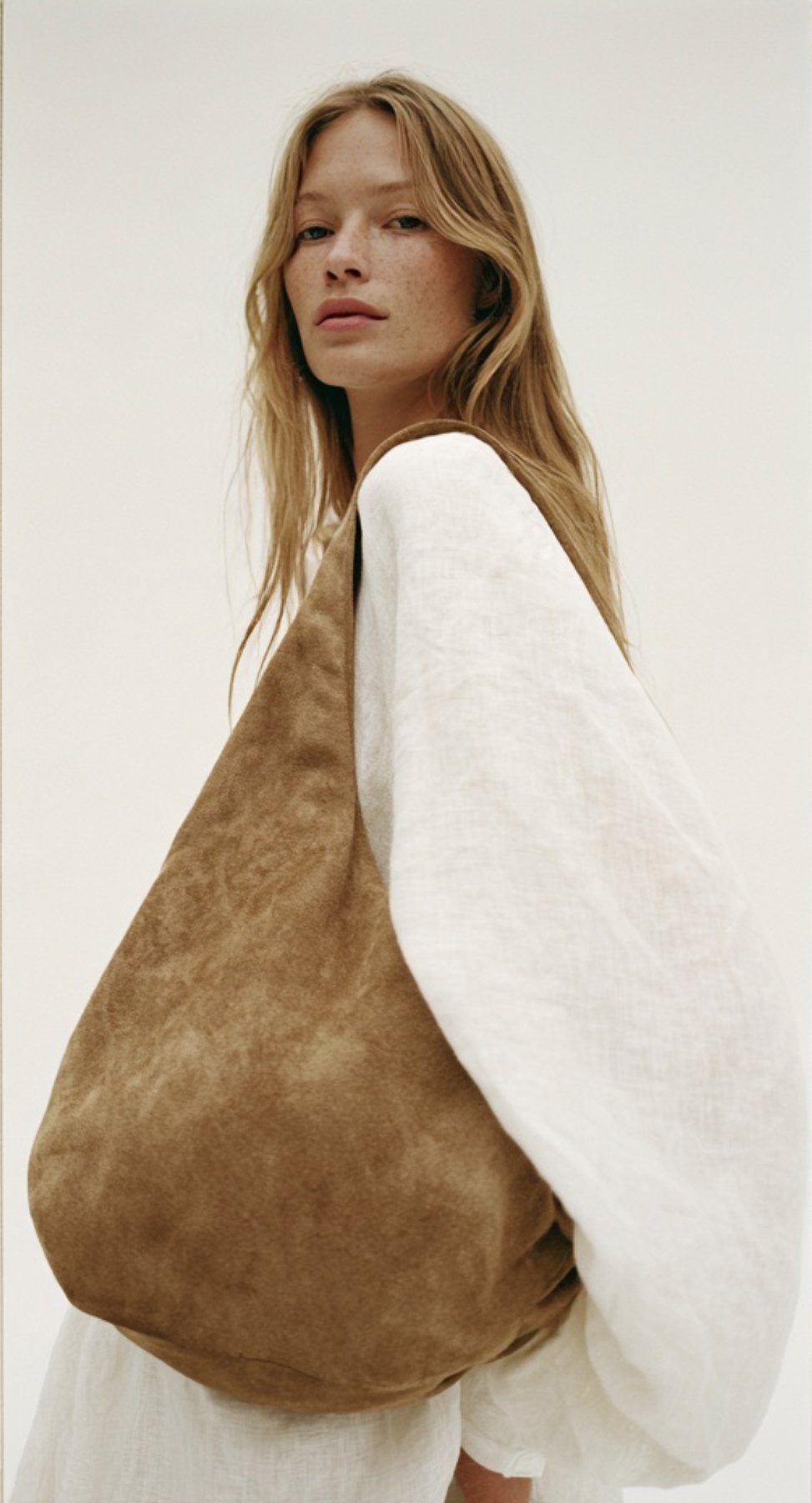
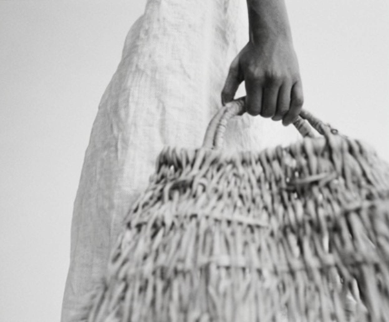
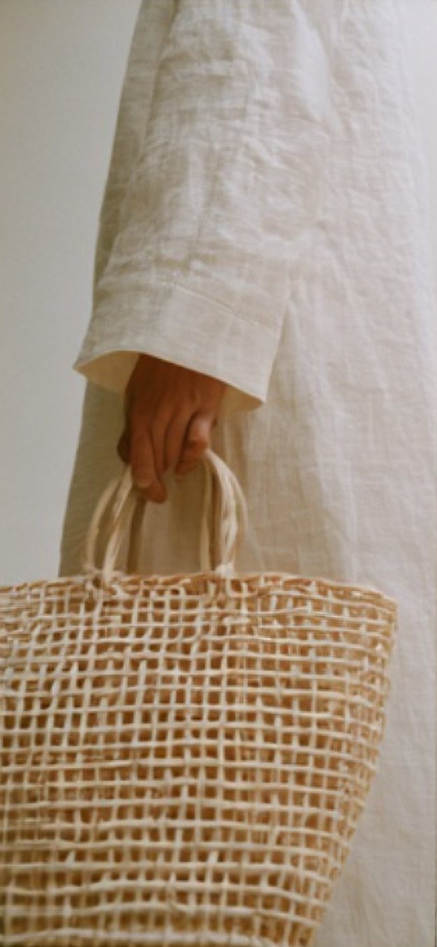
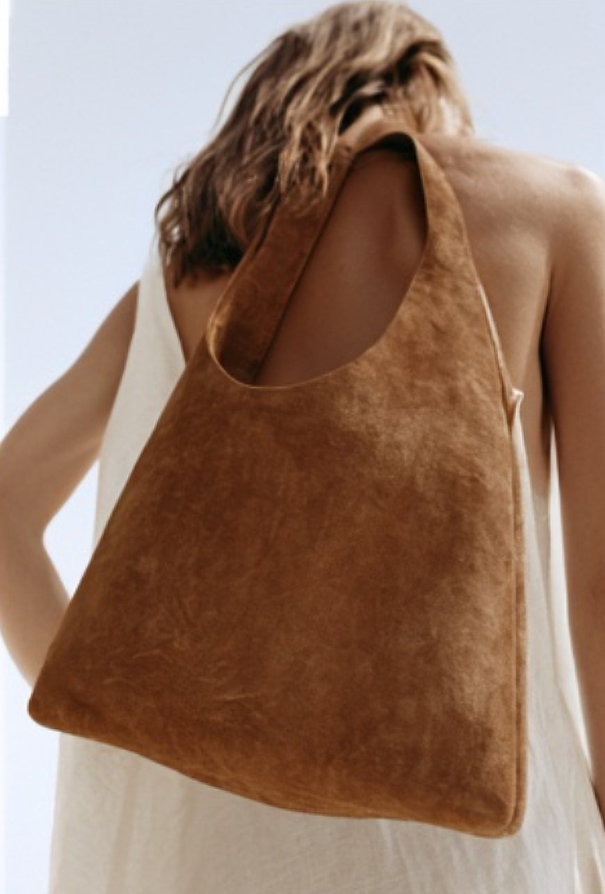
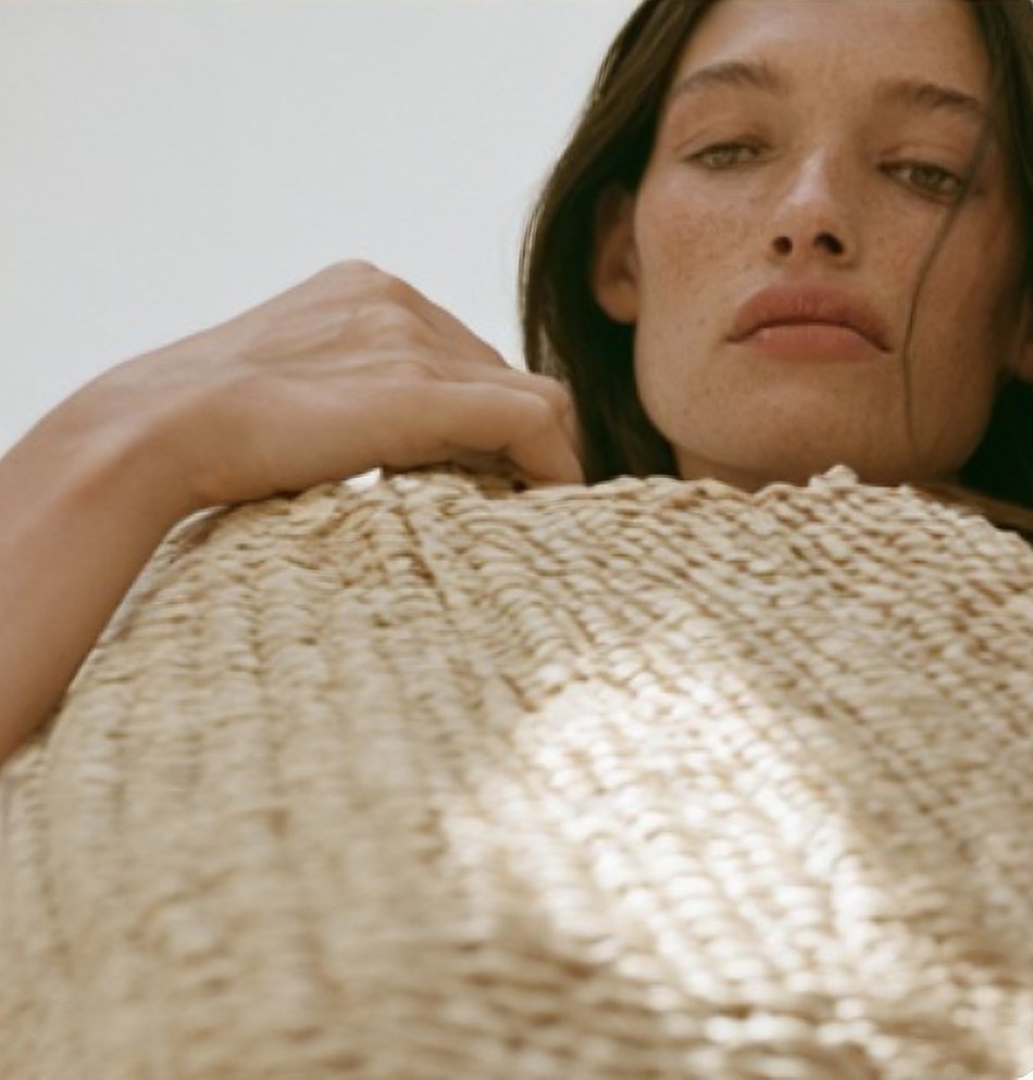
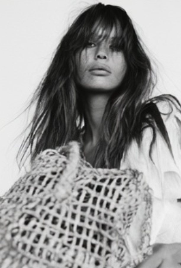
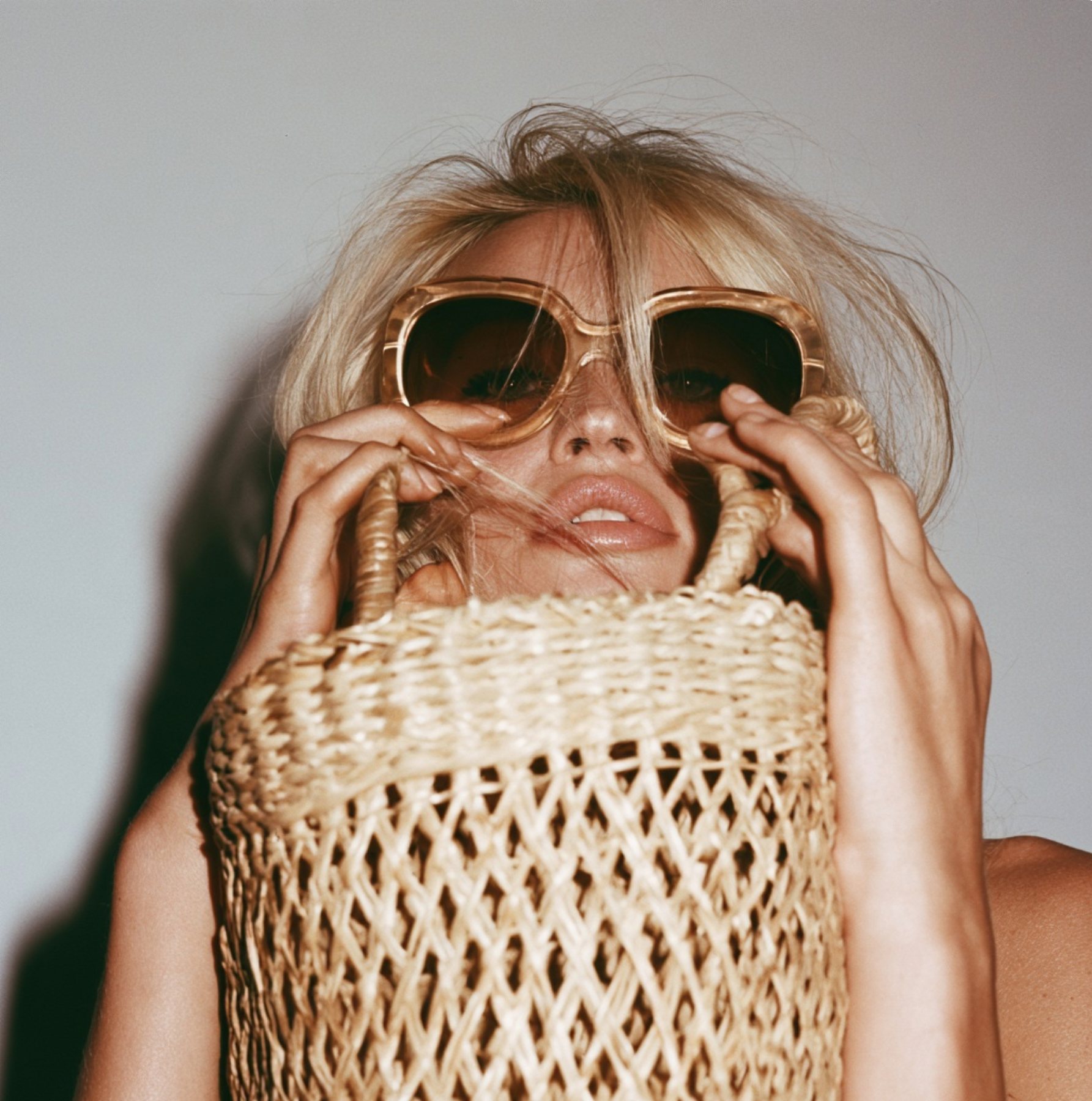
Heritage-rooted, never nostalgic.
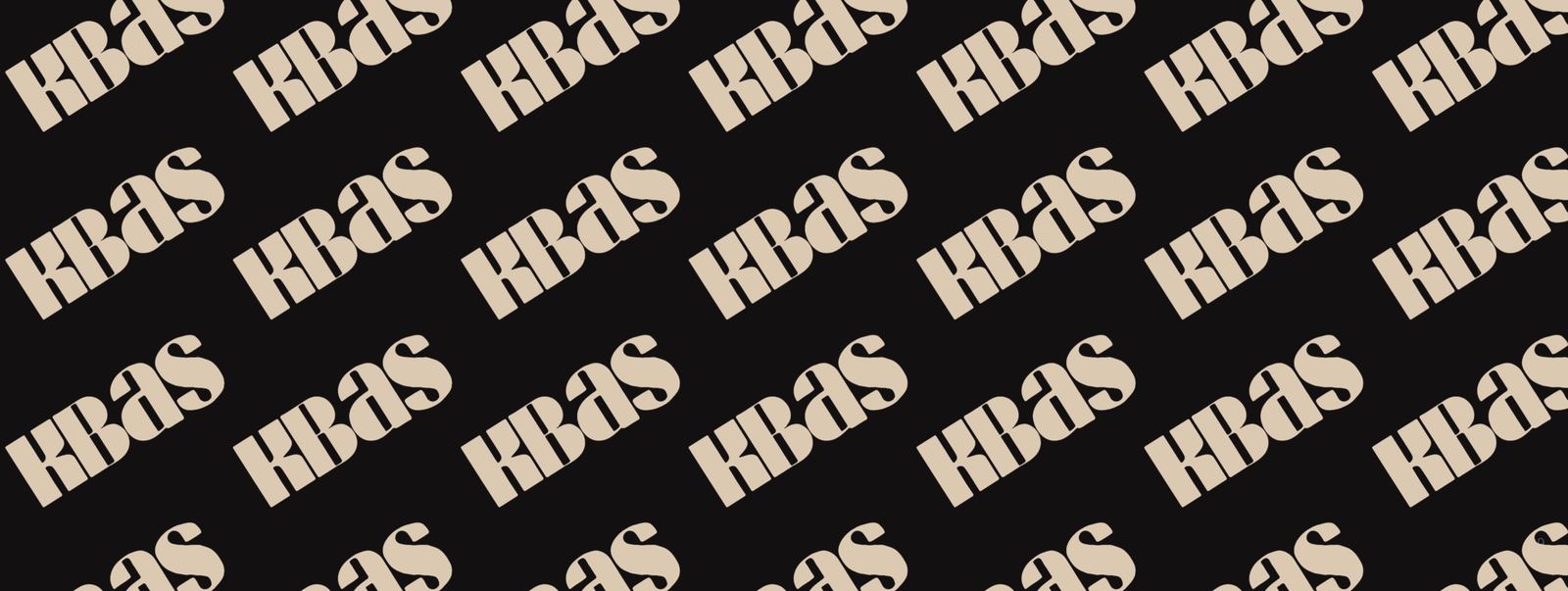
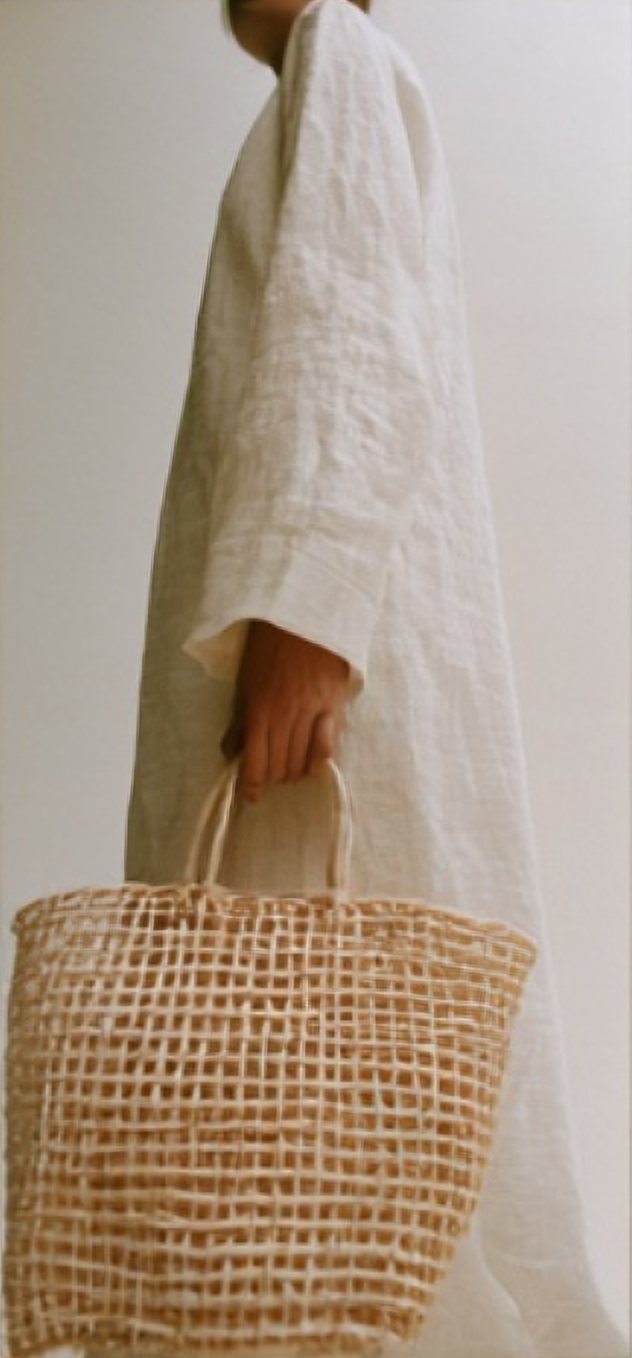
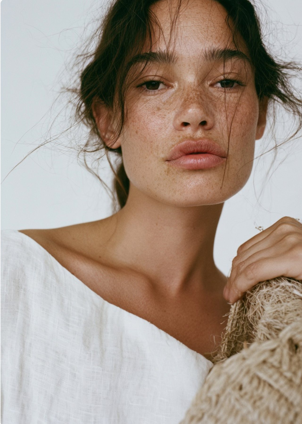
A considered evolution rather than change for its own sake. We redrew the hand-drawn K isotype into a symmetrical mark, paired it with a heavy, softened wordmark, and set the system to sit on photography: isotype above, wordmark below.
Drag to compare the old logo with the new one. Tap the photograph for the next look.
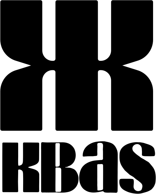
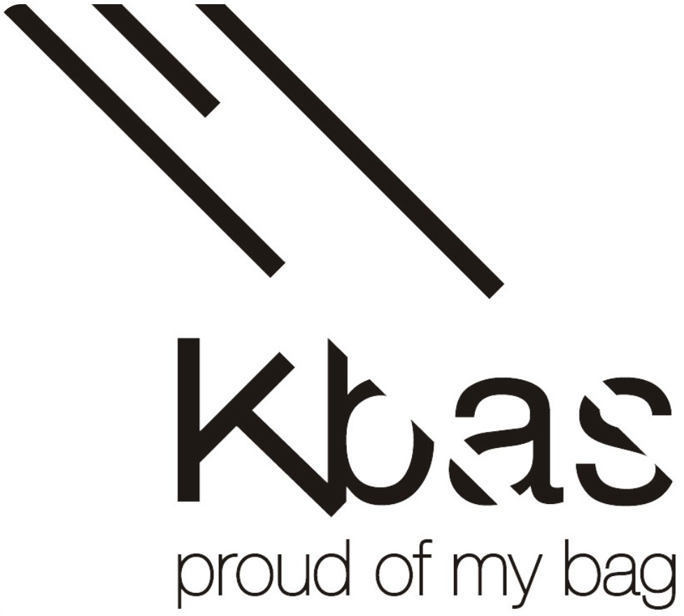
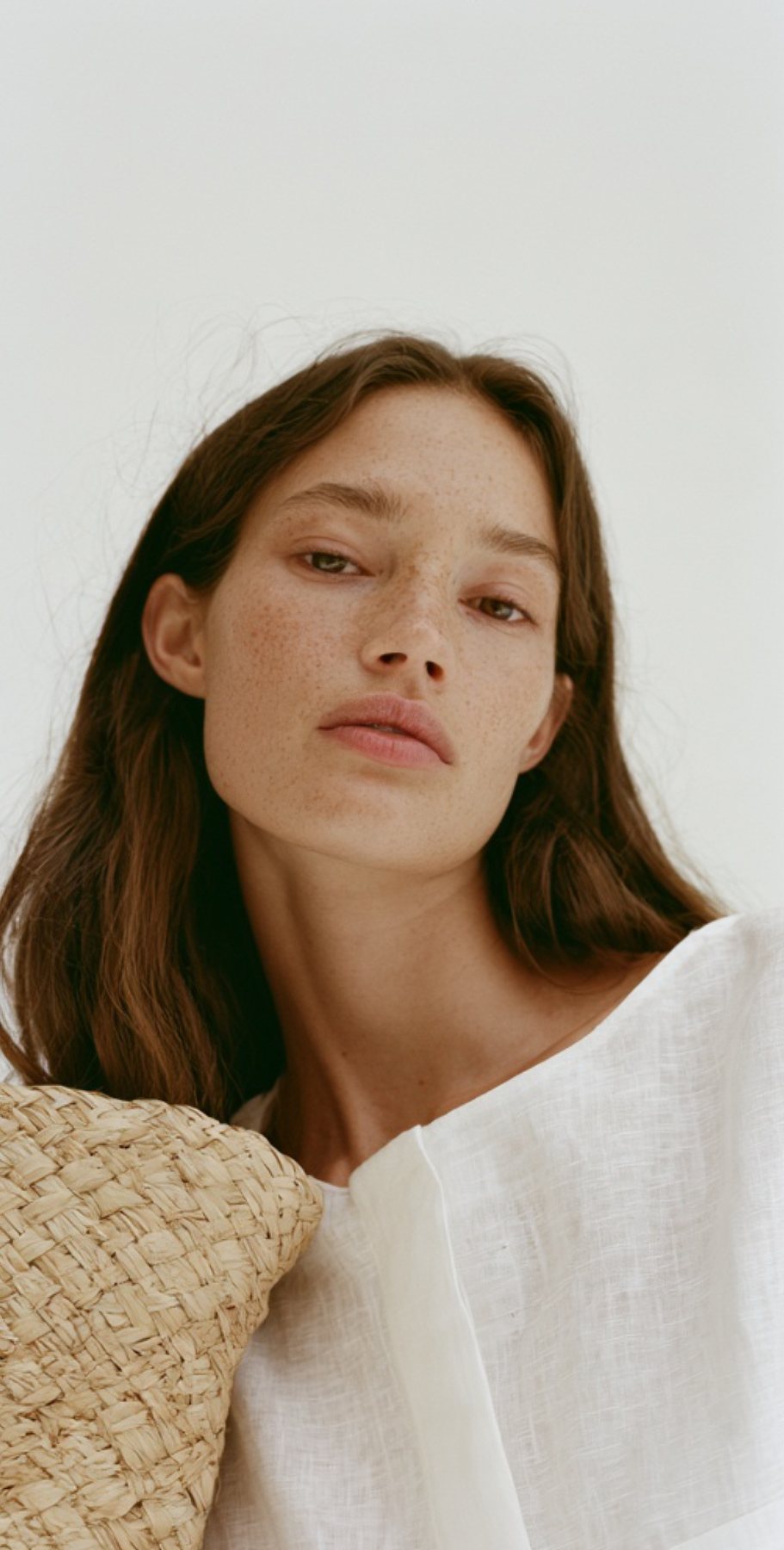
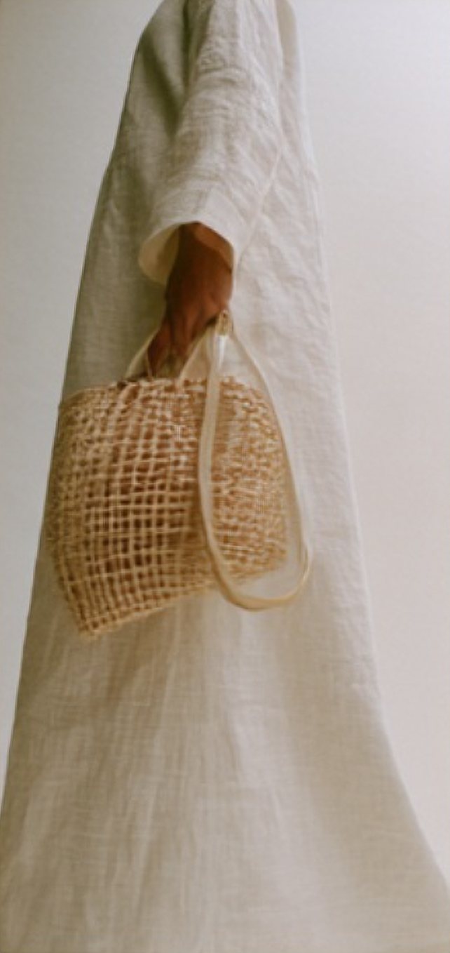
Logo placement as the guidelines set it: solid isotype on darker pictures, the outline on light ones.
Natural tones, local materials.
Colours inspired by the Mediterranean: the natural tones of the textures of local materials. Open a colour to see its values.
Values as specified in the brand guidelines
- HEX
- #E1C9AF
- RGB
- 225, 201, 175
- CMYK
- 0, 11, 22, 12
- Pantone
- 7528 C
- HEX
- #A88EA1
- RGB
- 168, 142, 161
- CMYK
- 0, 15, 4, 34
- Pantone
- 5215 C
- HEX
- #522003
- RGB
- 82, 32, 3
- CMYK
- 0, 61, 96, 68
- Pantone
- 4625 C
- HEX
- #7E9BC9
- RGB
- 126, 155, 201
- CMYK
- 37, 23, 0, 21
- Pantone
- 645 C
- HEX
- #1A1A1A
- RGB
- 26, 26, 26
- CMYK
- 0, 0, 0, 90
- Pantone
- Black 6 C
One voice for headlines, one for reading.
Sao TorpesA bold, retro grotesque for headlines, signs and the big moments. Heavy and slightly industrial; best large.
InterFor everything that has to be read: product details, labels, the website.
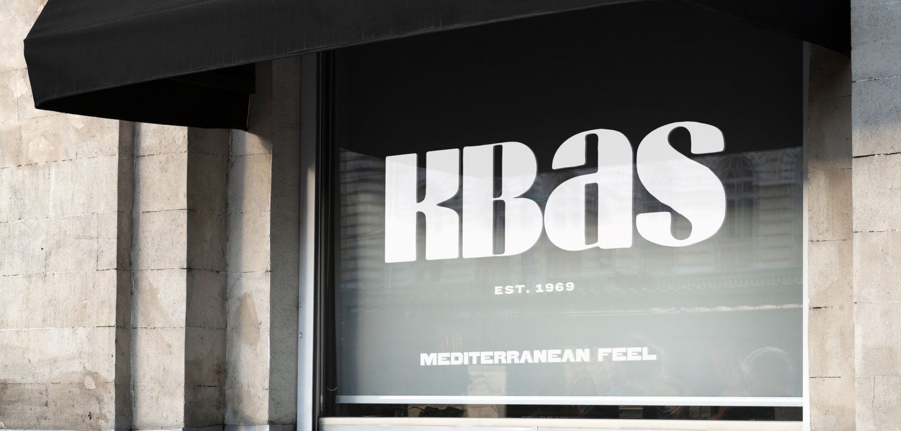
"Mediterranean feel"The line that runs through the shop window, the social templates and the guidelines.
Mediterranean, approachable, established, authentic. We speak like people, not a brand trying to impress.
Waves, shapes and a lot of K.
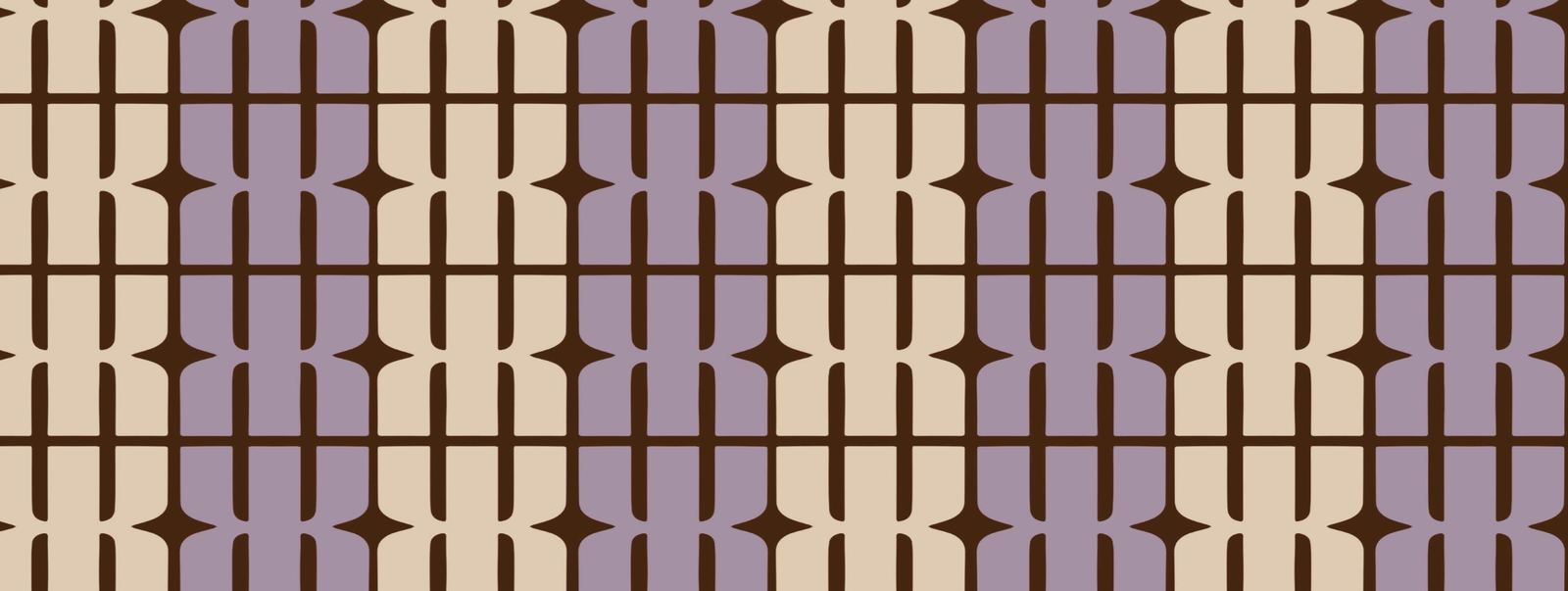
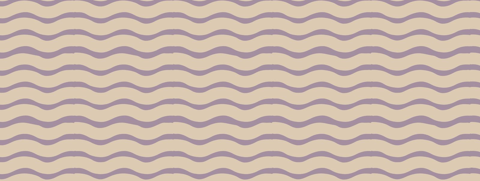
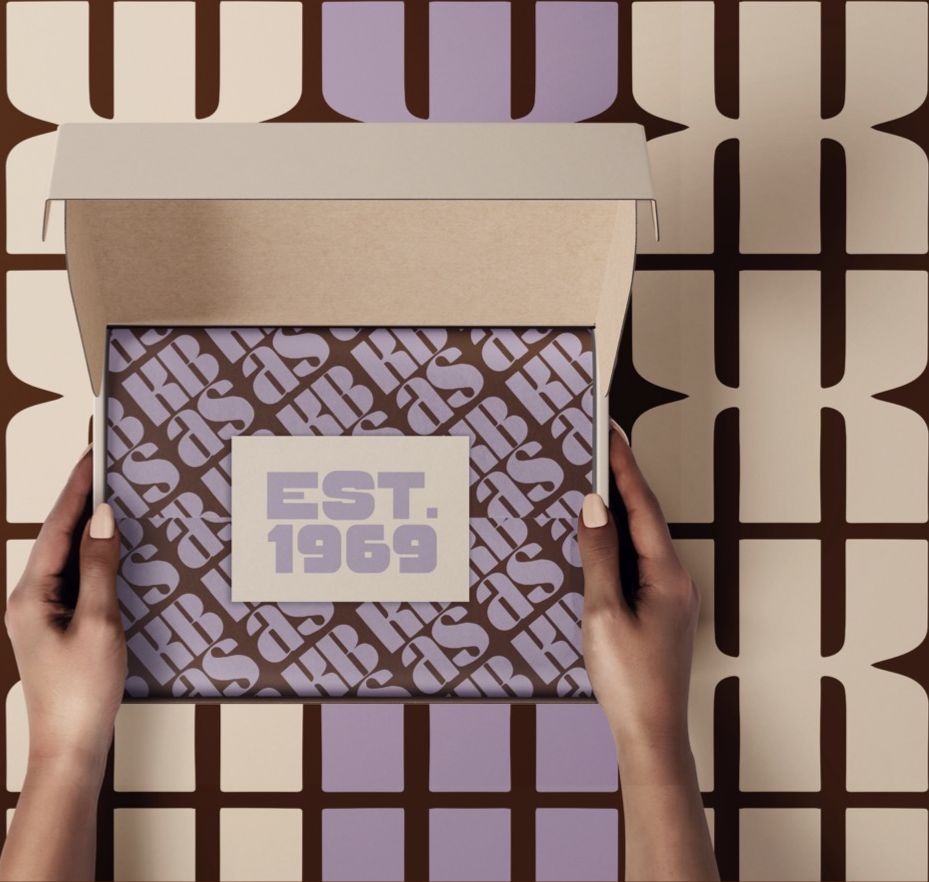
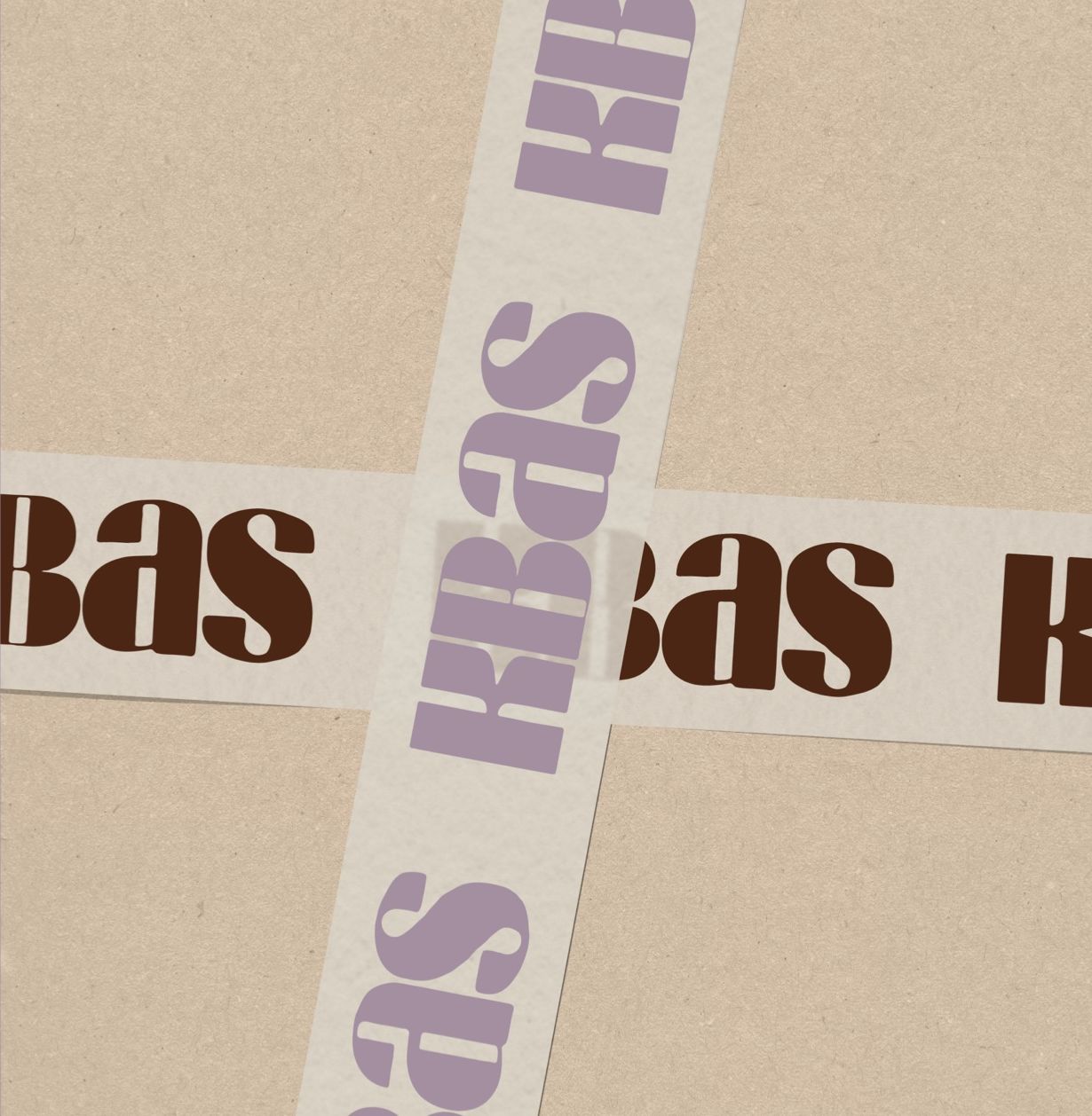
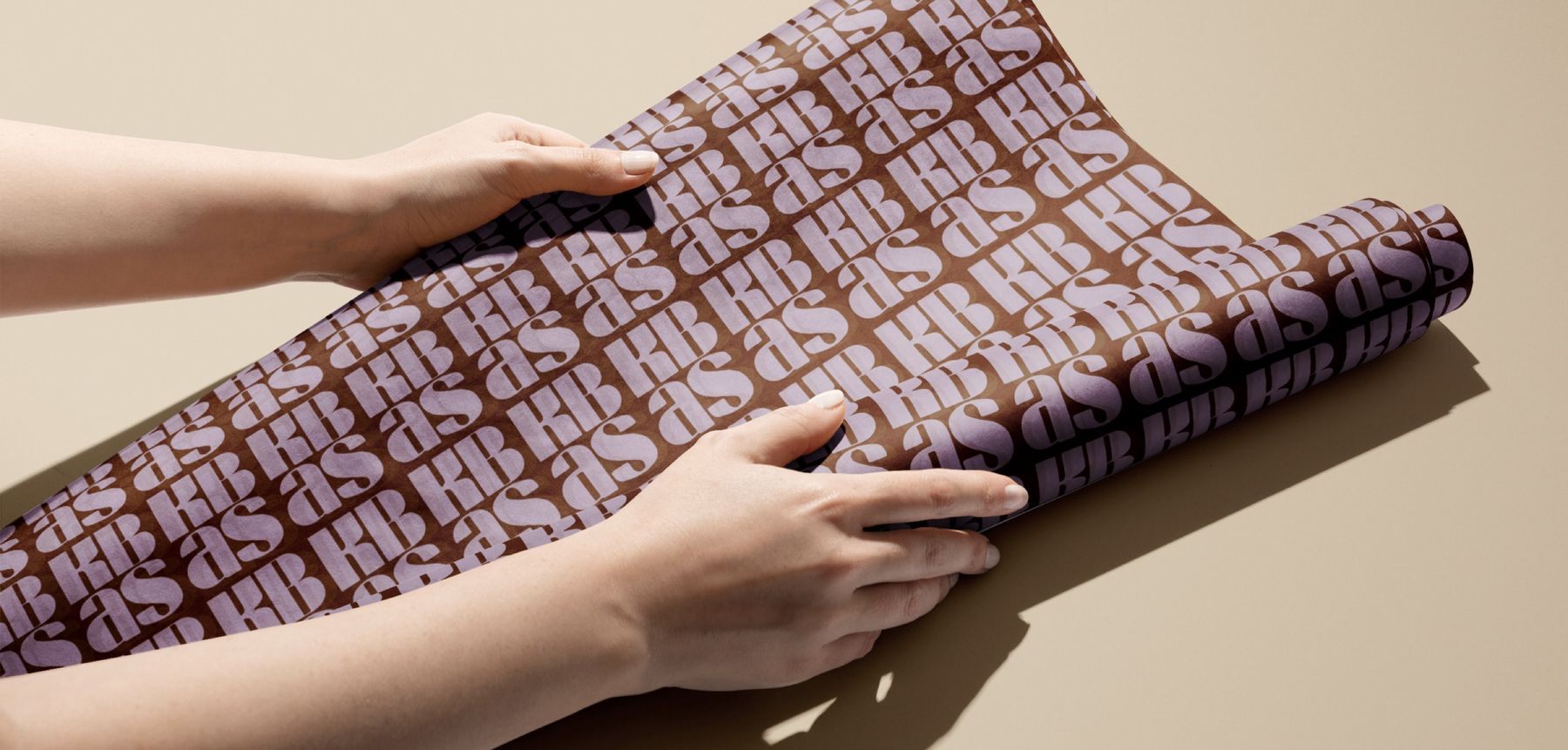
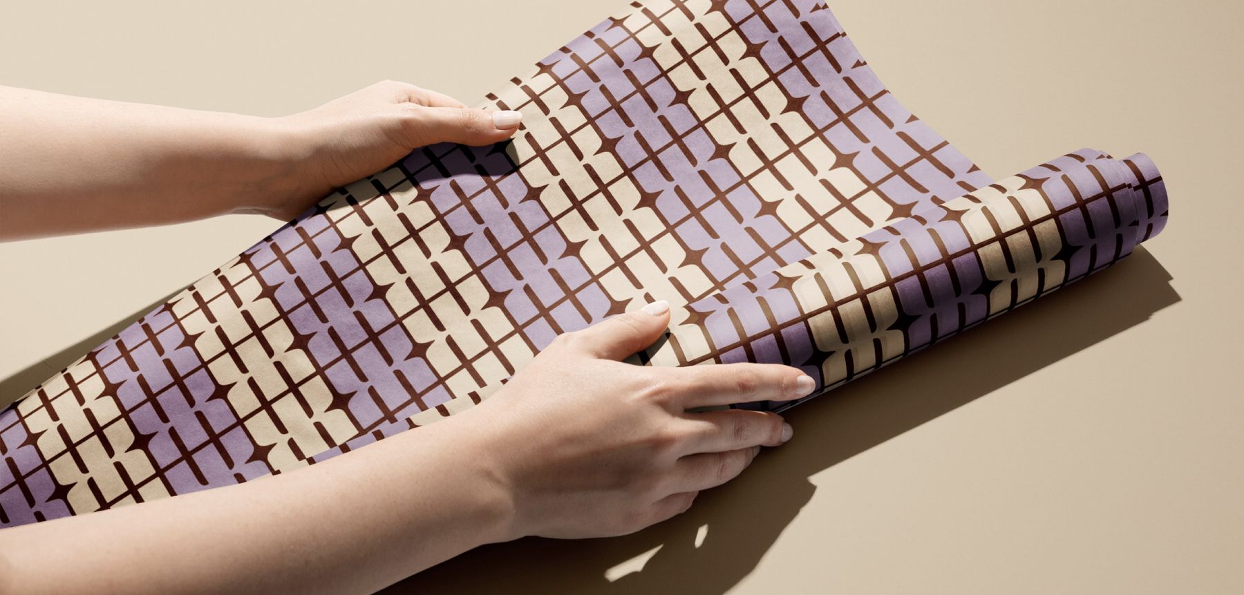
A family of shapes and patterns for linings, tissue, tape and wrapping paper, made to sit beside the pieces themselves.
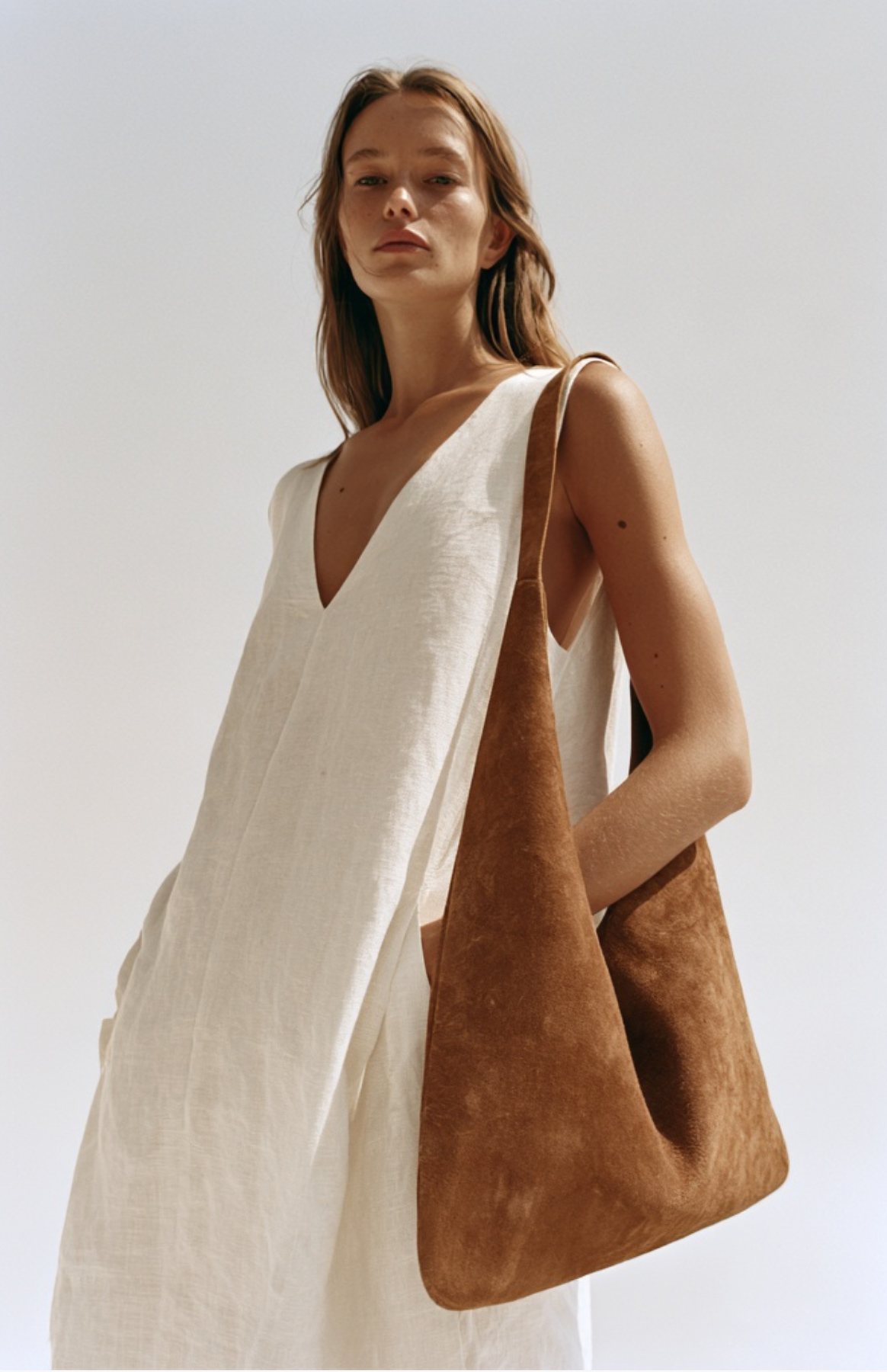
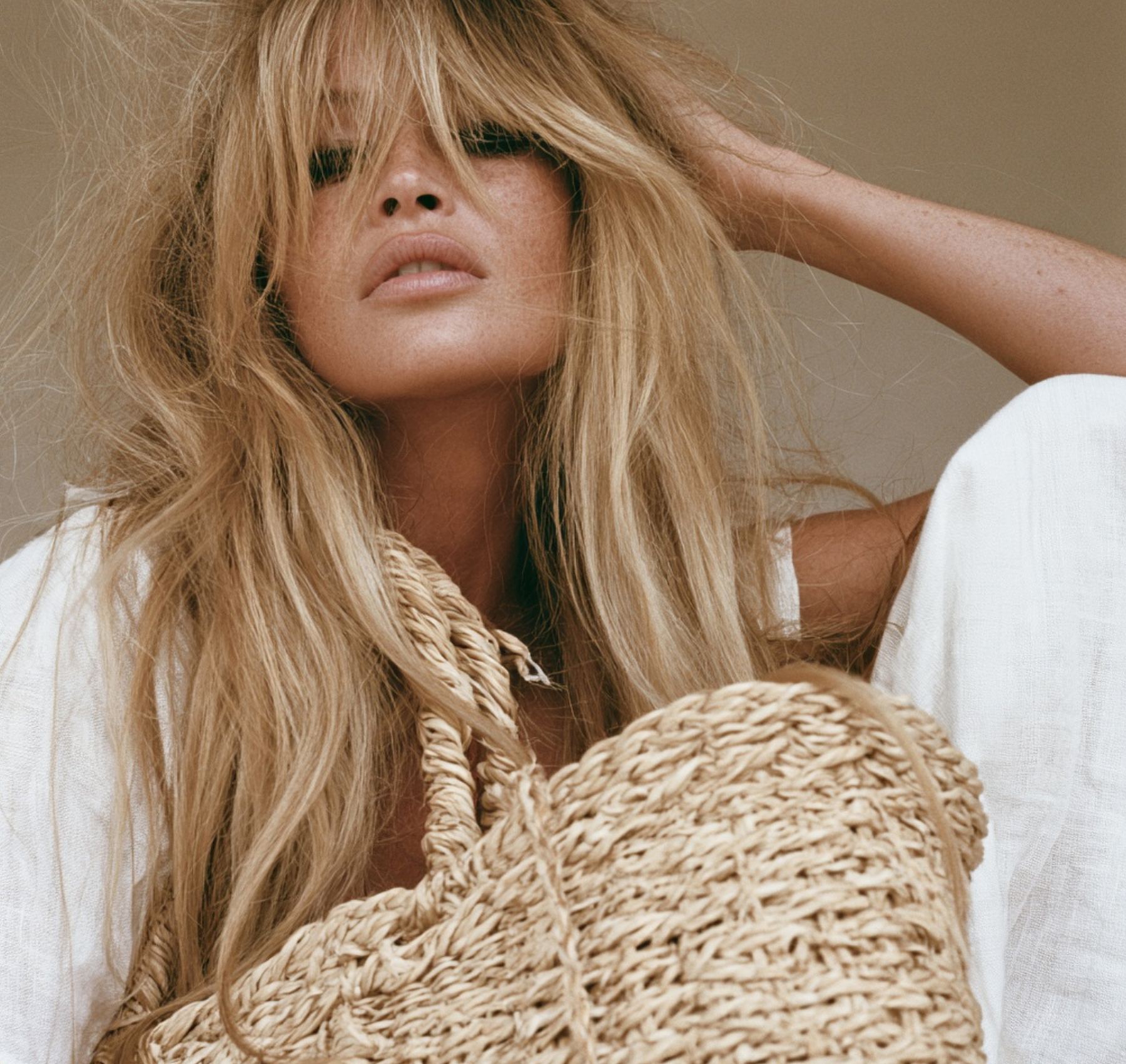
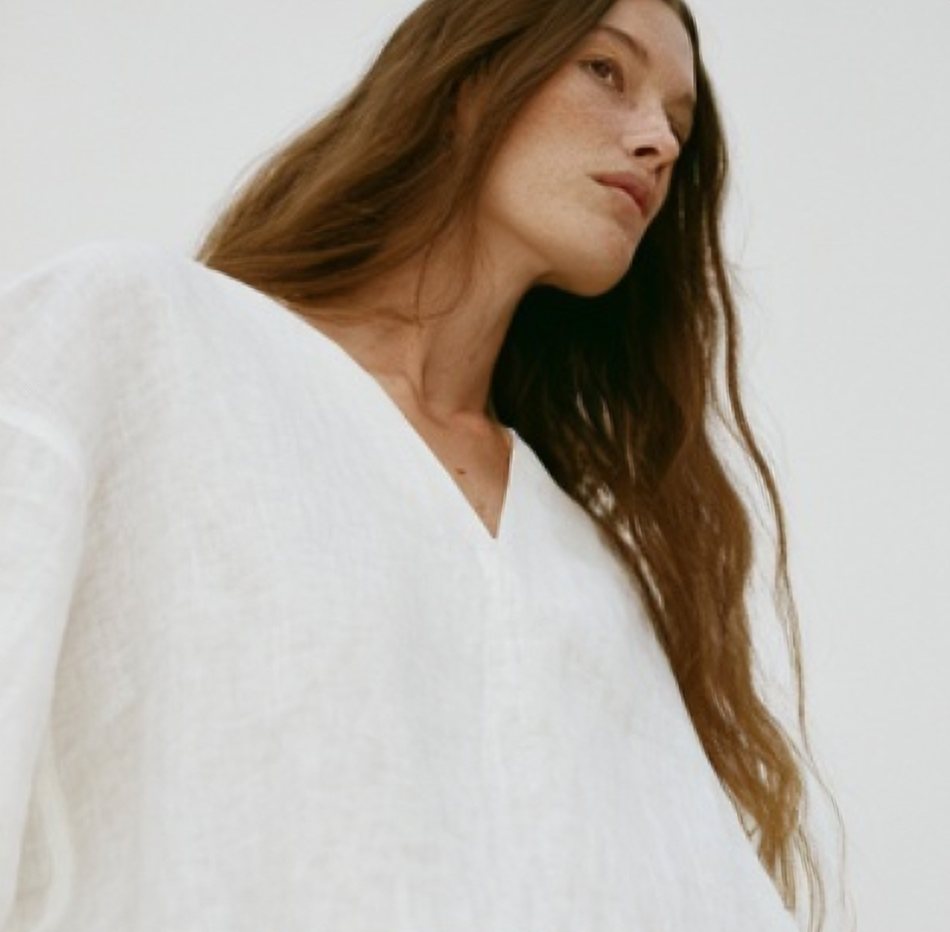
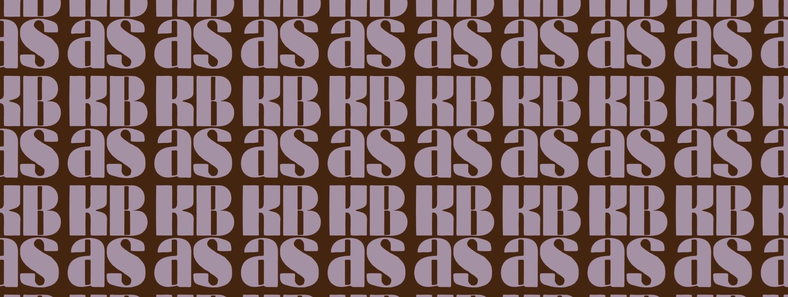
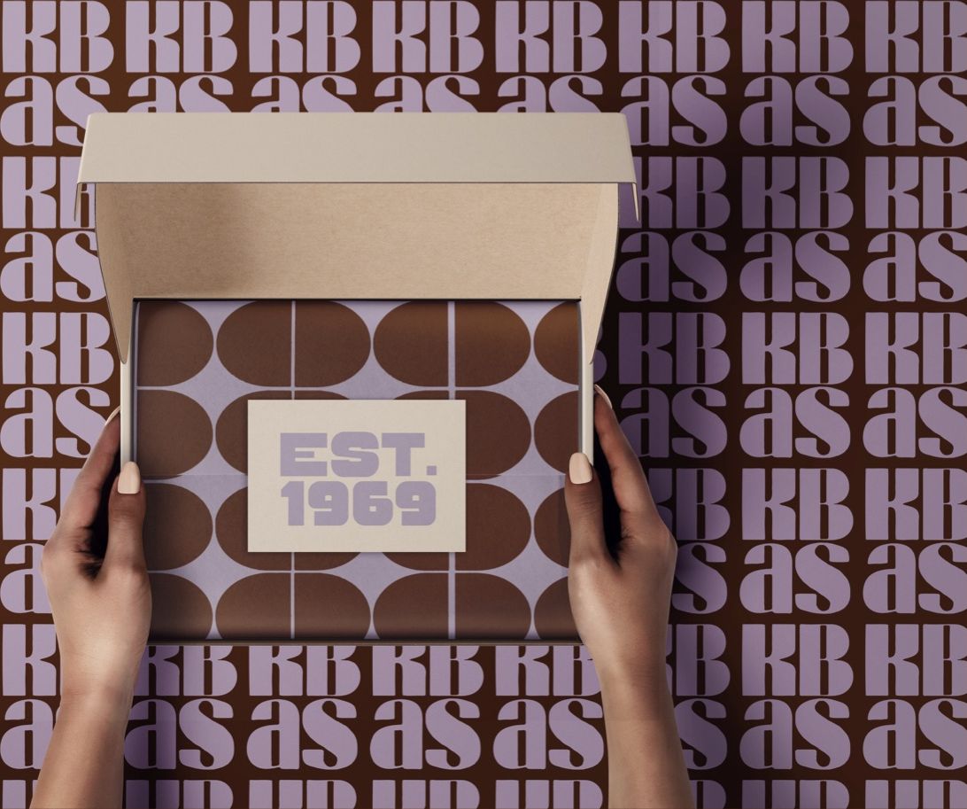
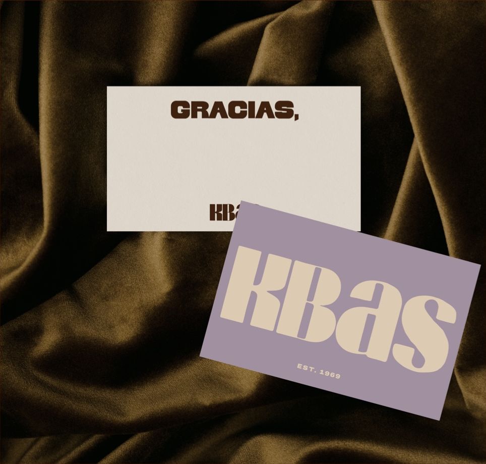
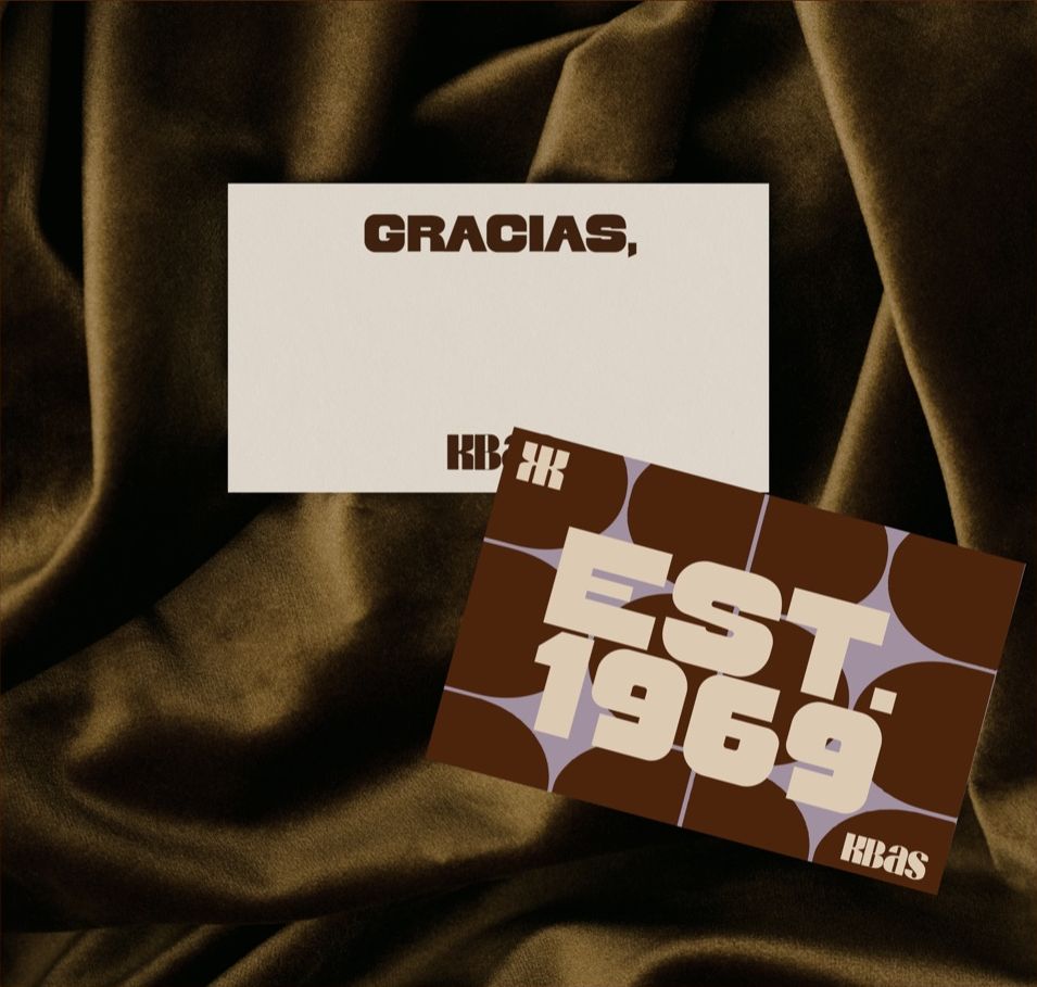
Open the box, find the pattern.
Kraft mailers lined with pattern, an "Est. 1969" insert and a Gracias card.
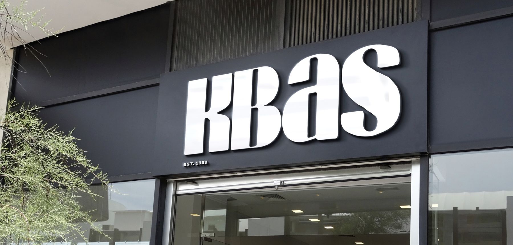
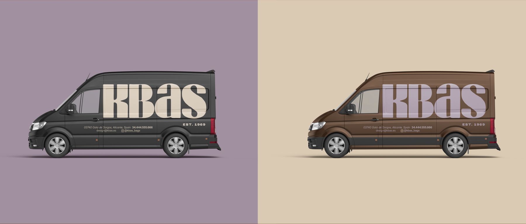
Seen from across the street.
The wordmark at full size: shopfront, window vinyl and the van.
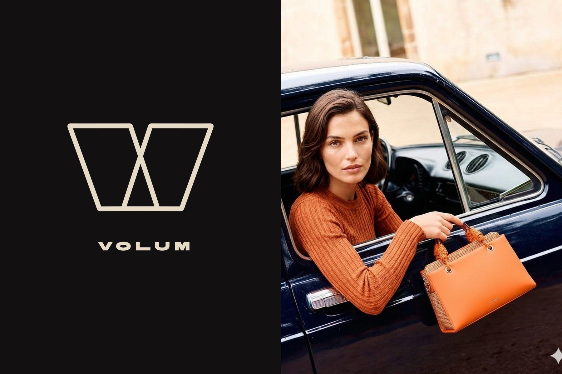
Volum. Born urban.
Made for real days. KBAS's younger brand has a world of its own: a W mark, Marios Black and Montserrat, a palette kept apart from KBAS's, and a line of its own.
What we made
- Isotype and logo suite, in seven colourways
- Colour palette, with print references
- Typography
- Shapes and patterns
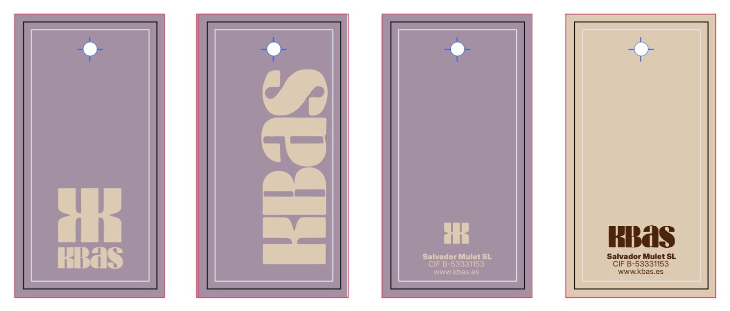
- Swing tags
- Stationery
- Packaging, tape and wrapping paper
- Signage and van livery
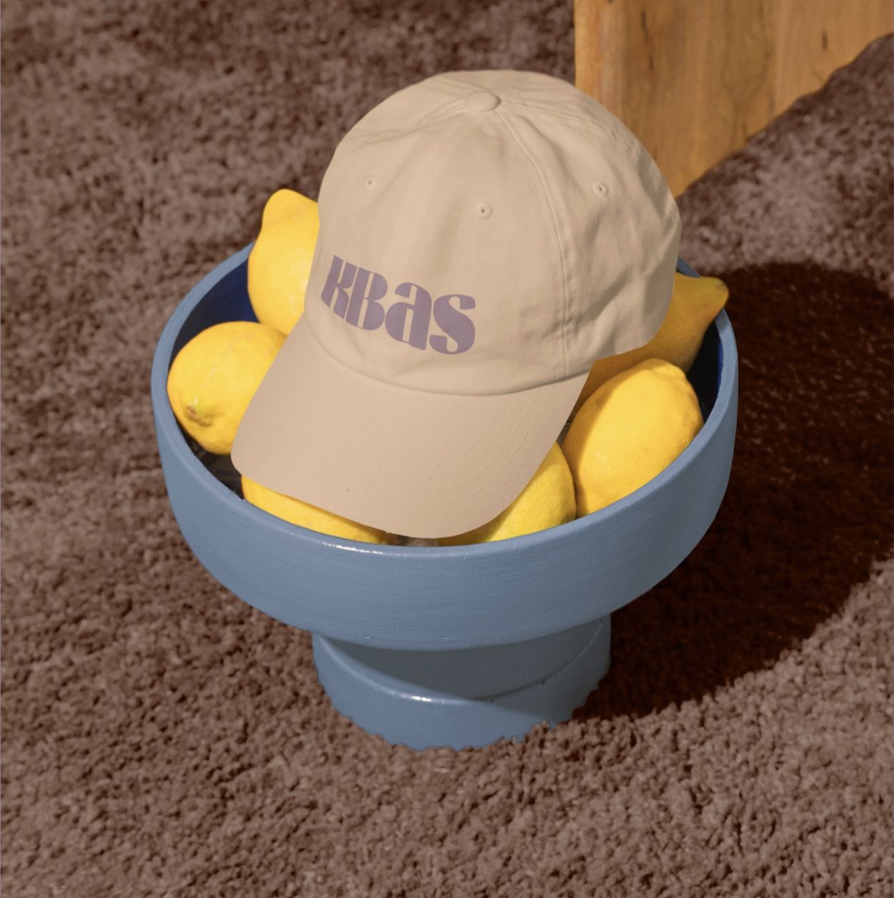
- Merchandise
- Social media templates
- Email signature
- Brand guidelines, in English and Spanish
- Volum identity
Gata de Gorgos · Costa Blanca
Credits
- Brand identity & guidelines
- Workhouse Collective
- Applications
- Signage, vans, packaging and merchandise are shown as visualised in the brand guidelines
- Imagery
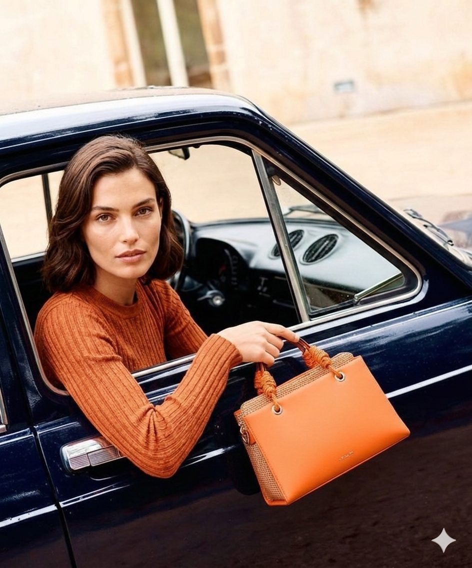
- Campaign imagery generated with AI to showcase the brand