Artemis Deco
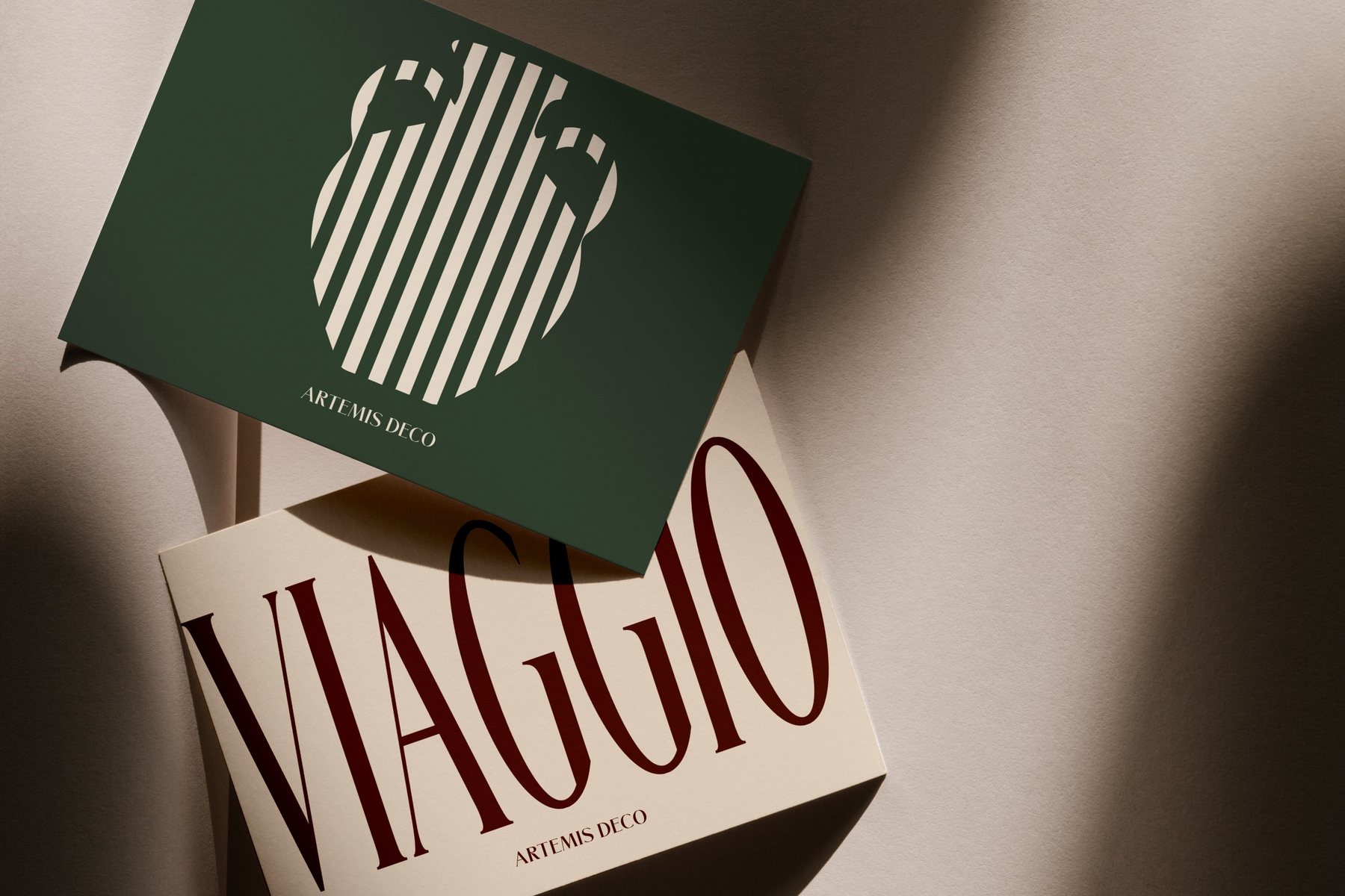
Al fresco meals, vibrant holidays, rustic warmth and nostalgia: the joys of sunny European getaways, brought home.
- Sector
- Homewares
- Location
- London, UK
- Services
- Brand identity, custom typeface, packaging and print, brand guidelines
Long summers, brought indoors.
Artemis Deco is a modern homewares brand based in London, with a collection that brings home the joys of sunny European getaways.
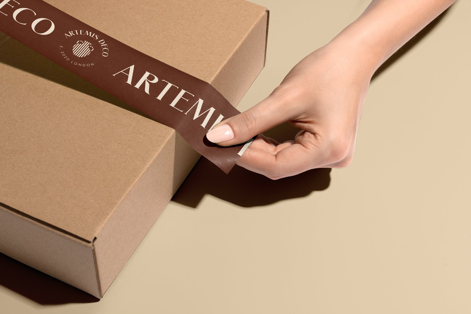
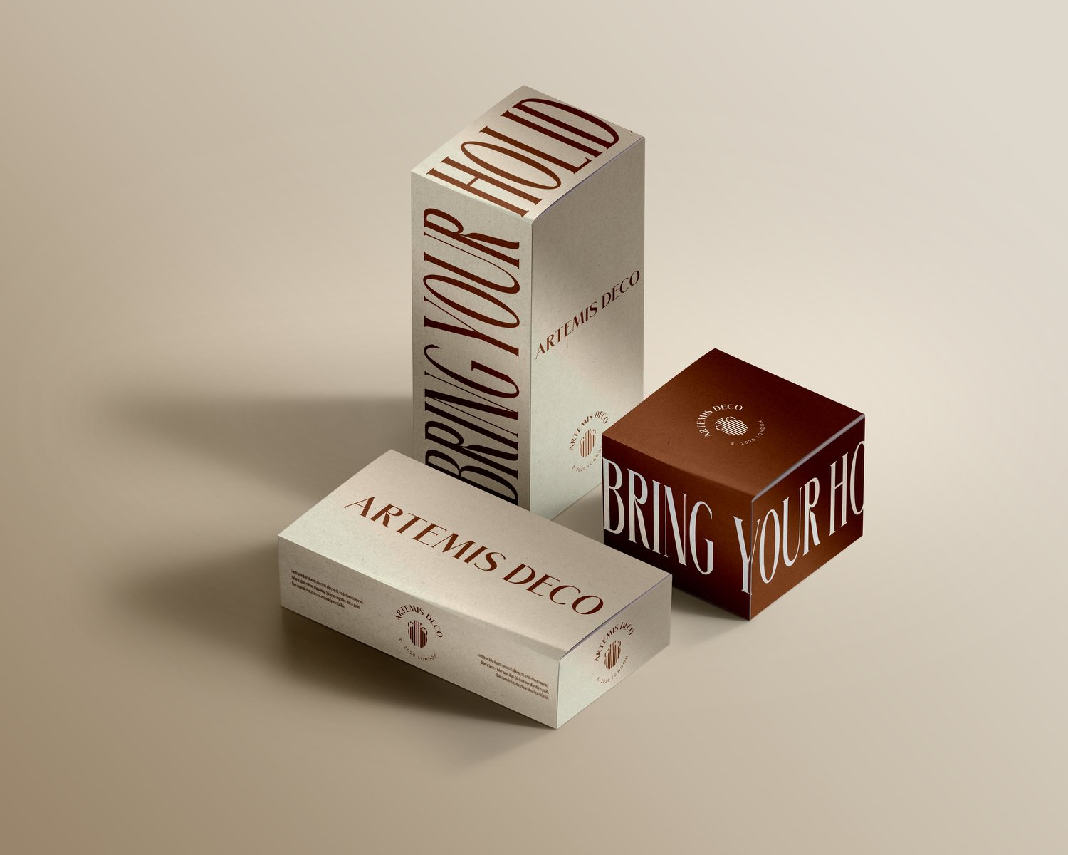
It came to us for a full brand identity: a wordmark and symbol, colour, a typeface of its own, and the packaging around every piece: boxes, tape, tissue and tags.
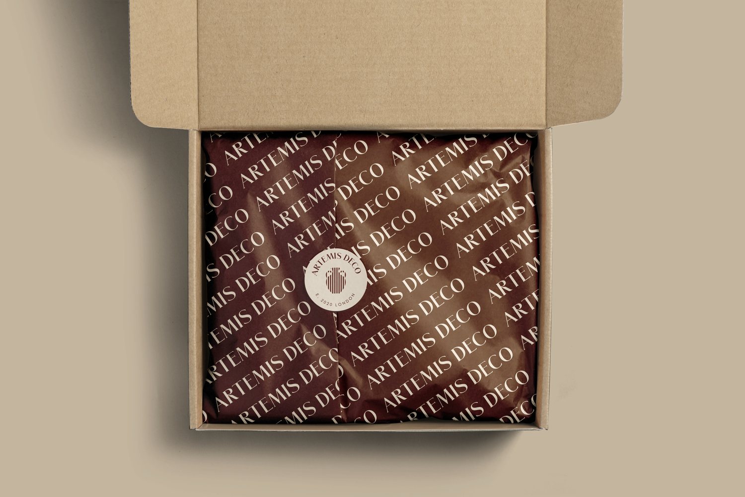
Every parcel a small holiday.
Bistro brown tape across kraft, a cream tag, the badge pressed into paper and stamped by hand.
All pictures are mockups made for the brand guidelines.
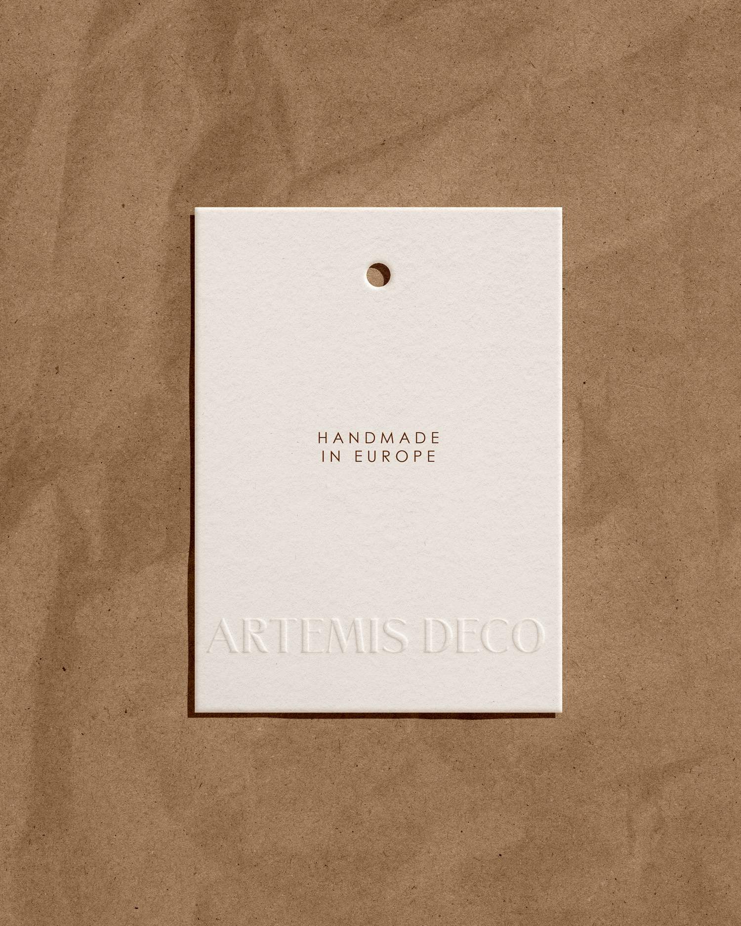
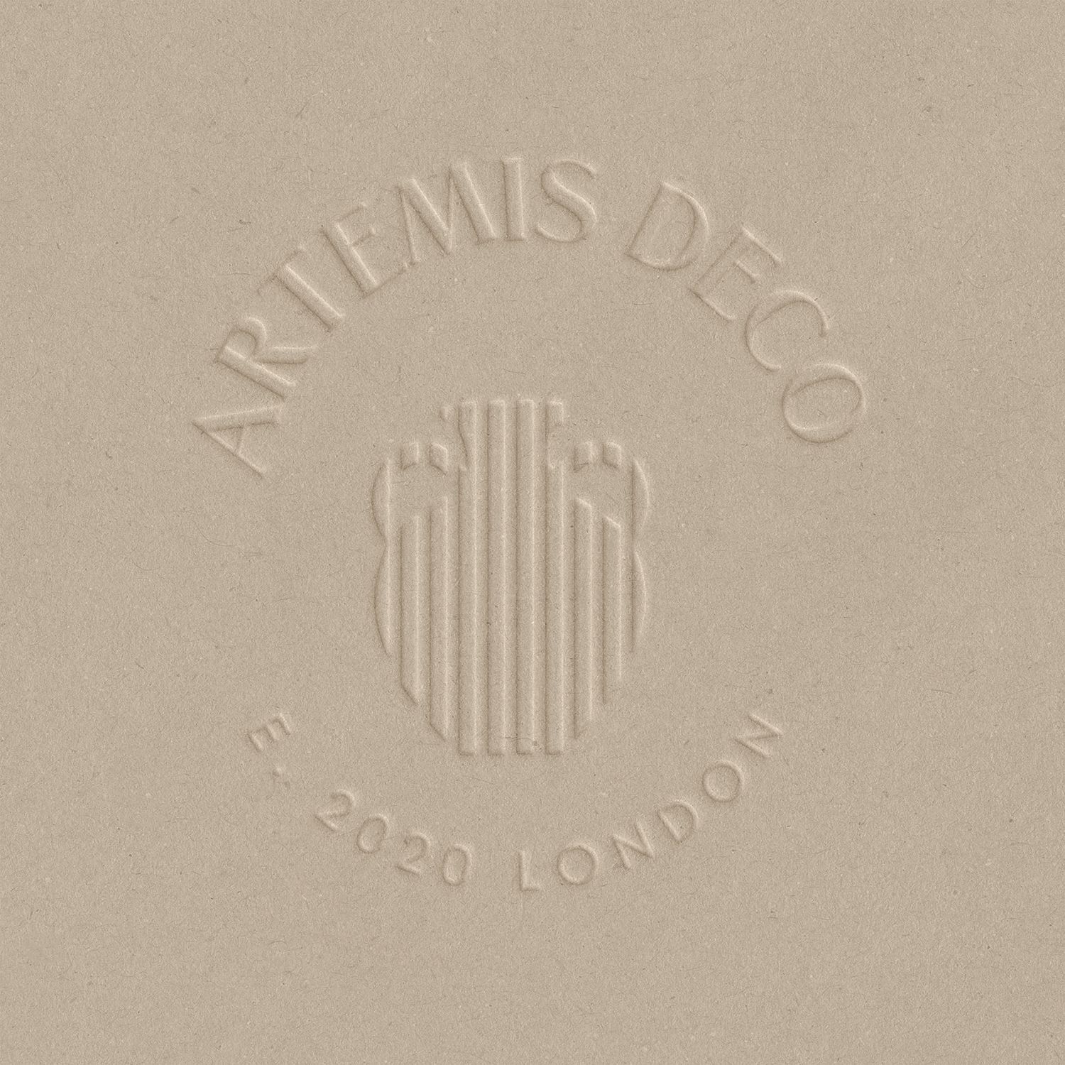
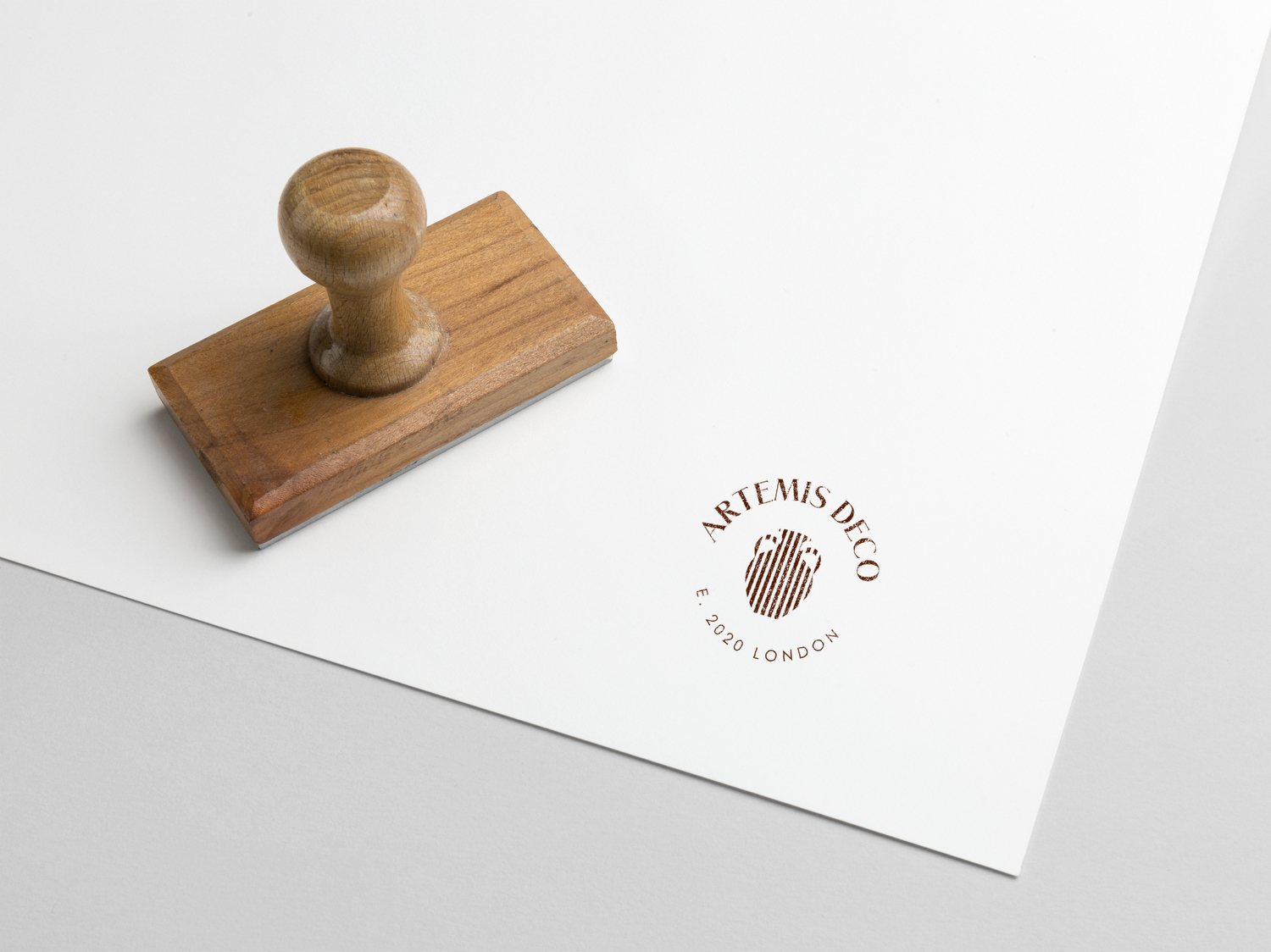
Bring your holiday home.
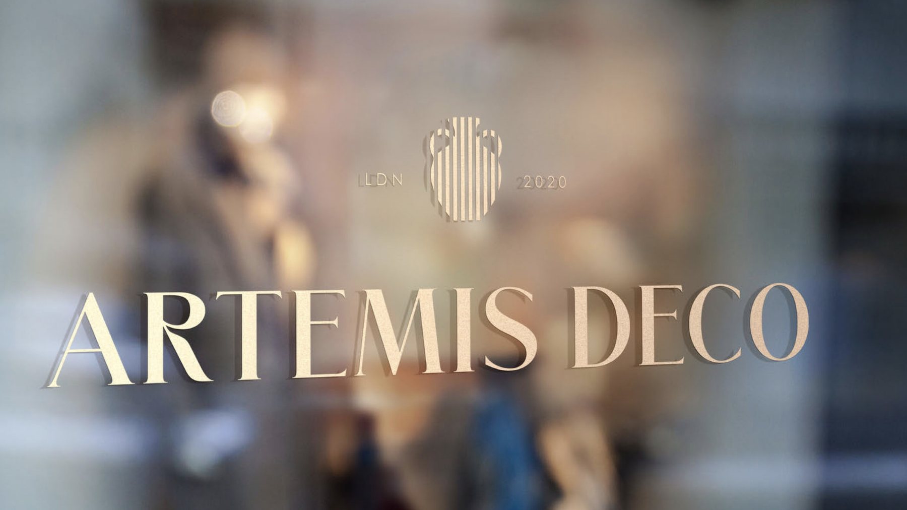
Chic, nostalgic, warm, romantic, sophisticated. A striped vase for a symbol, a serif wordmark that sits between “LDN” and “2020”, and colours inspired by stylish Italy.

Five words to design by.
The brand traits from the guidelines, set in Vacanza and run on repeat.
Crema, bistro, a flash of pomodoro.
Colours inspired by stylish Italy: strong, classy tones. Crema and bistro are the primary pair; racing green and pomodoro complete the palette.
Vacanza, drawn for the brand.
A tall, condensed display face made for Artemis Deco, built on Merchant. It sets “Viaggio” on the cards and “Bring your holiday home” up the side of every box.
Bistro brown, gold on glass.
Mockups from the brand guidelines.
What we made
- Logo and wordmark
- The vase symbol
- Round badge
- Vacanza, a custom display typeface
- Colour palette
- Brand guidelines
- Box, tape and tissue designs
- Swing tags, cards and slip cards
- Social media templates
Artemis Deco — London
Credits
- Brand identity, typeface & art direction
- Workhouse Collective
- Client
- Artemis Deco
- Pictures
- Mockups from the brand guidelines, visualised